Safari CSS Visual Effects Guide
- Table of Contents
- Jump To…
- Download Sample Code

Using 2D and 3D Transforms
Use CSS transform properties to give webpages a rich visual appearance without needing image files. Elements can be positioned, rotated, and scaled in 2D and 3D space; perspective can also be applied, giving elements the appearance of depth.
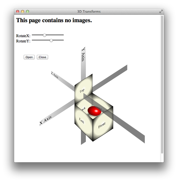
For example, Figure 7-1 shows a simple HTML document, containing only div elements and text but rendered using CSS transform and gradient properties. It appears to be a graphics-intensive page, yet the actual content is less than 2 KB of text, and the elements animate smoothly in 3D under user control.

How does this work? HTML elements are, after all, inherently two-dimensional, or planar; they have height and width, but no thickness. By rotating planar elements into the third dimension and applying perspective, however, these elements can be combined to create apparently solid objects. For example, five div elements are combined in Figure 7-1 to form the sides and bottom of an open box; the ball inside the box is another div element with rounded borders—a radial gradient gives it the appearance of depth.
Safari uses a series of transformation matrices to determine the mapping of every pixel on the screen. You don’t need to understand matrices to use them, however. You can apply a transform either by using a matrix or by calling one of the transform functions, such as scale() or rotate() .
Transforming an element typically causes its image to be rendered in a different position on the screen, but the position and dimensions of the element on the page are not changed—the top , left , height , and width properties, for example, are not altered by transforms. It is the coordinate system in which the element is drawn that is changed. Consequently, changing transform properties does not affect the layout of a webpage. This means that transforming an element can cause it to visually overlap neighboring elements, even though their positions and dimensions on the page may not overlap.
By default, transforms are applied using the center point of an element as the origin; rotation spins an object about its center, for example, and scaling expands or contracts an element from the center point. You can change the origin by setting the -webkit-transform-origin property.
A transform can cause part of an element to be displayed in the element’s overflow area. If the value of the overflow property is scroll or auto , scroll bars appear as needed if a transform renders part of an object outside the display area.
Safari supports both 2D and 3D transforms. Both 2D and 3D transforms are W3C drafts.
See http://www.w3.org/TR/css3-2d-transforms/ and http://www.w3.org/TR/css3-3d-transforms/ for the specifications.
2D Transform Functions
To apply a 2D transform to an element, use the -webkit-transform property. The transform property can be set using predefined transform functions—translation, rotation, and scaling—or it can be set using a matrix.
2D Translation
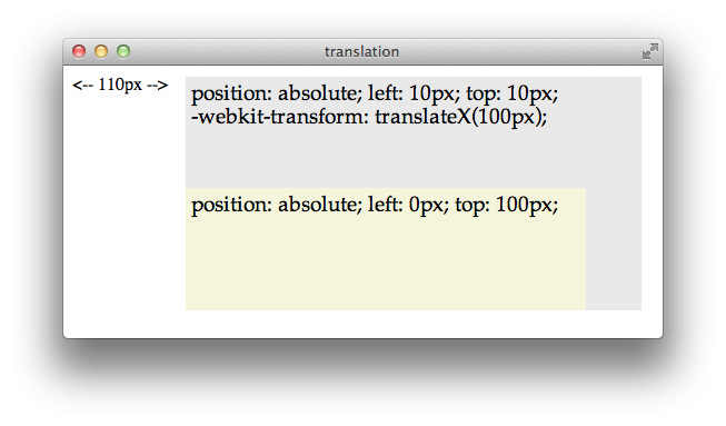
2D translation shifts the contents of an element by a horizontal or vertical offset without changing the top or left properties. The element’s position in the page layout is not changed, but the content is shifted and a shifted coordinate system applies to all descendants of the translated element.
For example, if a div element is positioned at the point 10,10 using the CSS properties top and left , and the element is then translated 100 pixels to the right, the element’s content is drawn at 110,10 . If a child of that div is positioned absolutely at the point 0,100 , the child is also shifted to the right and is drawn at the point 110,110 ; the specified position of 0,100 is shifted right by 100, and the child is drawn at 100,100 relative to the parent’s upper-left corner, which is still at 10,10 . Figure 7-2 illustrates this example.
To apply a 2D translation, set the -webkit-transform property to translateX(offset) , translateY(offset) , or both. For example:
2D Rotation
2D rotation is a rotation in the xy plane. By default, 2D rotation spins an object around its center point. To rotate an element around a different point, see Changing the Origin . Rotation is specified in degrees clockwise from the element’s orientation after any inherited rotation; rotation affects the specified element and all of its descendants. The coordinate system of any descendants is likewise rotated.
The following snippet rotates a div element 45 degrees clockwise, as shown in Figure 7-3 . The div element has a beige background and contains a paragraph of text and an image; both the text and the image inherit the div element’s rotation. A second div is positioned under the rotated div to show the original div ’s position prior to rotation.
<div style="-webkit-transform: rotate(45deg);" >

Rotation can be specified in positive or negative degrees. For example, -webkit-transform: rotate(-45deg); specifies a 45 degree rotation counterclockwise. If rotation is animated, specifying a degree of rotation greater than the current degree causes clockwise rotation; specifying a degree of rotation less than the current degree causes counter-clockwise rotation.
When animating rotation, it can be useful to specify a rotation of more than 360 degrees. For example, Listing 7-1 uses JavaScript to set a rotation of 3600deg , causing a div element to spin clockwise ten times. The text spins once on page load, and a button lets the user spin it again.
Listing 7-1 Animating 2D rotation
Notice that the CSS property -webkit-transform is addressed in JavaScript as element.style.webkitTransform . Notice also that the spin() function increments the rotation angle by 3600 each time it is called; setting the angle to 3600deg repeatedly would have no effect.
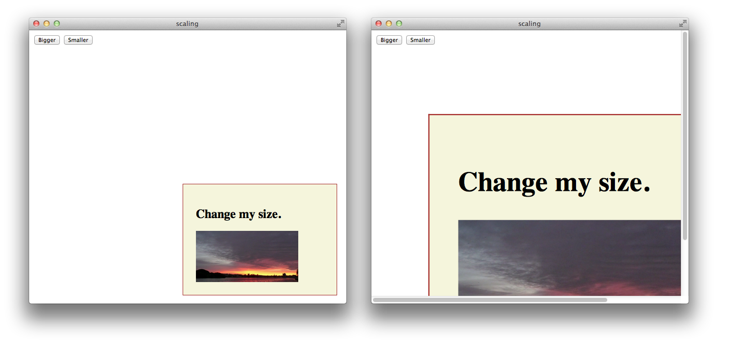
2D scaling makes an element smaller or larger in one or two dimensions. Scaling affects the whole element, including any border thickness. By default, the element is scaled up or down relative to its center, which causes all four of the element’s corners to be redrawn at new locations. The element’s top , left , height , and width properties are unchanged, however, so the layout of the page is not affected. Consequently, scaling an element up can cause it to cover other elements on the page unless you design the layout to allow room for the expansion.
Scaling modifies the coordinate system of an element’s descendants, multiplying the x and y values by the specified scaling factor. For example, if a div element contains an image positioned absolutely at 10,10 , with a height and width of 100 pixels, scaling-up the div element by a factor of two results in a 200 x 200 image, positioned at 20,20 relative to the div ’s upper-left corner, which moves up and to the left. Figure 7-4 illustrates this behavior.
Apply a scale transformation by setting the -webkit-transform property to scale(x y) , where x and y are independent scale factors for width and height, or by setting the transform property to scale(size) , where size is the scaling factor in both dimensions. For example:
style=”webkit-transform: scale(1, 2)” renders an element the same width, but twice as tall.
style=”webkit-transform: scale(2, 0.5)” renders an element twice as wide and half as tall.
style=”webkit-transform: scale(1.5)” renders an element 1.5 times larger.
Setting Multiple Transforms
Different transforms, such as rotation and scaling, are applied by setting different values to a single property: -webkit-transform . Consequently, if you apply one transform to an element and then specify another transform, the first transform is no longer applied; the new value overwrites the old one, as with any CSS property.
There are two different ways to perform multiple transforms on an element—both scaling and rotating an element, for example:
Use inheritance to apply multiple transforms: create a scaled div element, for example, add your element as a child, then rotate the child element.
Set the -webkit-transform property of the element to a space-delimited list of transform functions, such as:
-webkit-transform: scale(2) rotate(45deg);
When a list of functions is provided, the final transformation value for the element is obtained by performing a matrix concatenation of each entry in the list. (Matrix concatenation can have some side effects, such as normalizing the rotation angle modulo 360.)
Both approaches—transform inheritance and transform function lists—are valid. The following two examples illustrate two ways to apply a set of transforms to an element. Listing 7-2 sets an element’s transform property to a list of transform functions. Listing 7-3 produces the same results by applying each transform to a nested element.
Listing 7-2 Setting multiple transforms using a list
Listing 7-3 Nesting 2D transforms
Changing the Origin
By default, the origin for transforms is the center of an element’s bounding box. Most HTML and CSS entities use the upper-left corner as the default origin, but for transforms, it is usually more convenient to use the center of an element as a reference point. Consequently, elements rotate around their center by default, and scale up or down from the center out.
To change the origin for transforms of a given element, set the -webkit-transform-origin property. The new origin is specified as a distance or percentage from the element’s upper-left corner. For example, the default center origin can be expressed as -webkit-transform-origin: 50% 50%; . Changing the origin to 0% 0% or 0px 0px causes transformation to occur around the upper-left corner of the element.
The code in Listing 7-4 rotates the second box in Figure 7-5 around the top-right corner.
Listing 7-4 Rotating an element around the top-right corner

3D Transforms
The standard HTML coordinate system has two axes—the x-axis increases horizontally to the right, and the y-axis increases vertically downwards. With 3D transforms, a z-axis is added, with positive values rising out of the window toward the user and negative values falling away from the user, as Figure 7-6 illustrates.

3D transforms move an element out of the usual xy plane, where z=0—the plane of the display. A transformed element is still two dimensional, but it no longer lies in the usual plane. A transformed object may be translated along the z-axis, rotated around the x- or y-axis, or transformed using some combination of translation and rotation.
All HTML elements have a z-index. The z-index controls the rendering order when elements overlap. An element’s z-index has nothing to do with its z-axis coordinate. Transformed objects follow the standard HTML rendering rules—objects with higher z-index values are drawn on top of other objects with lower z-index values—but for elements sharing the same z-index, the areas with higher z-axis coordinate values are drawn on top.
Adding 3D Perspective
To render elements with the appearance of depth, you must specify a perspective. If you apply 3D transforms without setting the perspective, elements appear flattened. For example, if you rotate an element around its y-axis without setting the perspective, the element just appears narrower. If you rotate an element 90 degrees from the default xy plane, it is seen edge-on—the element either disappears entirely or is displayed as a line.
Adding perspective distorts the appearance of objects realistically, making nearby things appear larger and distant things look smaller. The closer the object, the greater the distortion. In order for Safari to create the illusion of depth, it’s necessary to specify a point of view, or perspective. Once Safari knows where the user’s eye is relative to an element, it knows how much distortion to apply and where.
Use the -webkit-perspective property to set the perspective for all the descendants of an element. For example:
The perspective is specified in distance from the screen. You may specify the distance in pixels, centimeters, inches, or any CSS distance unit. If no unit type is supplied, px is assumed.
Listing 7-5 sets the -webkit-perspective property using a slider.
Listing 7-5 Adding a perspective slider
Figure 7-7 shows two perspective settings from the previous example in which a child element is rotated 45 degrees around the x-axis. The elements are shown at the same rotation and position in both cases, but with different perspective settings.

You can envision perspective view as a pyramid, with the point of the pyramid centered at the user’s eye, and the base of the pyramid extending into the infinite distance. By setting the -webkit-perspective property, you specify the viewpoint’s z-coordinate—how far the point of the pyramid lies above the screen. By default, the x- and y-coordinates of the viewpoint are the center of the element to which the -webkit-perspective property belongs.
Shift the viewpoint horizontally or vertically by setting the -webkit-perspective-origin property. The default setting is -webkit-perspective-origin: 50% 50% . To set the viewpoint above the top-left corner of an element, for example, set the element’s style to -webkit-perspective-origin: 0px 0px .
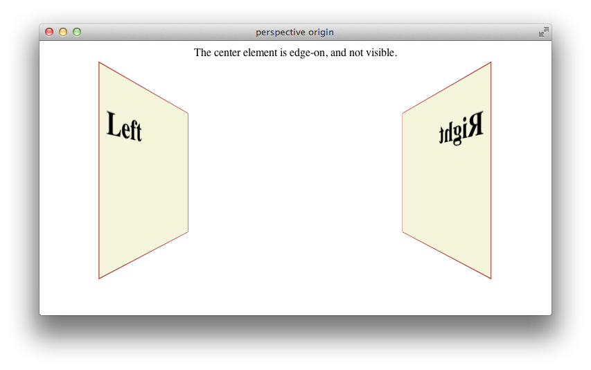
The perspective origin can affect the visibility of elements. For example, if an element is rotated 90 degrees out of the default plane, it is viewed edge-on: if the perspective origin is directly in front of the element, the element is invisible; but if the origin is off-center from the element, one side of the element can be seen. For example, Listing 7-6 creates three div elements, all rotated 90 degrees. The elements positioned on the left and right of the window are visible. When the window is sized appropriately, however, the element in the center of the window is edge-on to the viewer and cannot be seen, as Figure 7-8 illustrates.
Listing 7-6 Effects of perspective origin
Creating a 3D Space
By default, the descendants of an element are flattened into the plane of their parent. When you apply a 3D transform to an element, that element’s plane is no longer the default xy plane—the plane of the display. All descendants of the element share that element’s new plane. In order to further transform the children of an element relative to that element’s plane, you must set the -webkit-transform-style property to preserve-3d , creating a 3D space. For example:
<div id="space3d" style="-webkit-transform-style: preserve-3d;">
Setting the transform style to preserve-3d in an element makes that element into a 3D container; all the element’s immediate children can be manipulated independently in 3D, relative to the parent. Because HTML elements are flat, a transformed child also occupies a plane in 3D space. Each child can occupy a separate plane, or multiple children can share the same plane. By default, any descendants of these transformed children are flattened into their parental plane; setting the transform style to preserve-3d affects only an element’s immediate children.
3D containers can be nested. Enabling 3D transforms in one of a container element’s descendants creates a nested 3D layer; children of that descendant can be transformed in 3D, relative to their container’s plane. You need to enable 3D in a particular element only if the element’s children are to be transformed in 3D relative to that element’s plane.
Any transform applied to a 3D container is inherited by all of its descendants. By applying a rotation to the highest level 3D container, for example, you are able to rotate the view of all of the container’s contents at once.
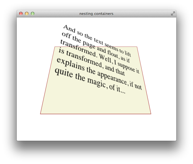
Listing 7-7 gives an example of a nested pair of 3D containers, illustrated in Figure 7-9 . The topmost container has a child div element rotated 45 degrees on its x-axis, so it appears to be tilted away from the viewer. This child div is also a 3D container, containing a paragraph of text rotated 35 degrees on its right edge away from the container, causing the text to appear to lift off the page.
Listing 7-7 Nested 3D rotations
Generally speaking, you need to create only a single 3D container—all 3D transforms can be applied relative to the default xy plane, and global transforms can be applied to the top-level container and inherited by all its descendants. Sometimes it may be convenient to manipulate a subgroup of transformed elements as a unit, however; in such a case, it makes sense to create a nested container.
To disable 3D for an element’s children dynamically, set the -webkit-transform-style property to flat . Applying a 3D transform when the transform style is set to flat does not move the element out of its parent’s plane.
3D Transform Functions
Like 2D transforms, 3D transforms are set using the -webkit-transform property. You can apply a transform to an element by specifying a transform function, a list of transform functions, or by passing in a 3D matrix. There are several functions that perform 3D transforms:
translateZ(distance) —Moves an element closer or farther away.
translate3d(x, y, z) —Moves an element in three dimensions.
rotateX(degrees) —Rotates an element around the x-axis, moving the top and bottom closer or farther away.
rotateY(degrees) —Rotates an element around the y-axis, moving the left and right sides closer or farther away.
perspective(distance) —Sets the 3D perspective for a single element.
3D Translation
3D translation moves an element closer to or farther from the viewer by changing its position on the z-axis. Use the translateZ() function to shift an element on the z-axis, or the translate3d(x, y, z) function to shift an element on two or three axes. For example:
The 3D translation functions work like their 2D counterparts, except that the z offset cannot be specified as a percentage. Z-axis units may be positive (towards the viewer) or negative (away from the viewer). Figure 7-10 shows two identical div elements with same height, width, and x and y positions, one translated on the z-axis by 100 px and the other translated by -100 px.
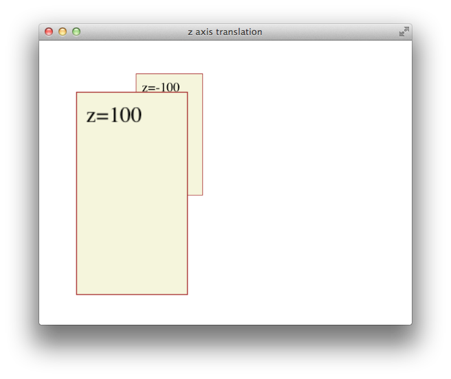
All descendants of an element inherit its z-axis translation. Note that the text in the previous illustration is translated along with its parent.
3D Rotation
You can rotate an element in 3D either around the y-axis, so that the right and left edges get nearer and farther away, or around the x-axis, so that the top and bottom edges get nearer and farther away. For example:
Rotation is around an imaginary x- or y-axis that passes through the element’s origin. By default, the origin is at the center of an object. Positive x units rotate the top edge away. Positive y units rotate the right edge away. This is illustrated in Figure 7-11 .
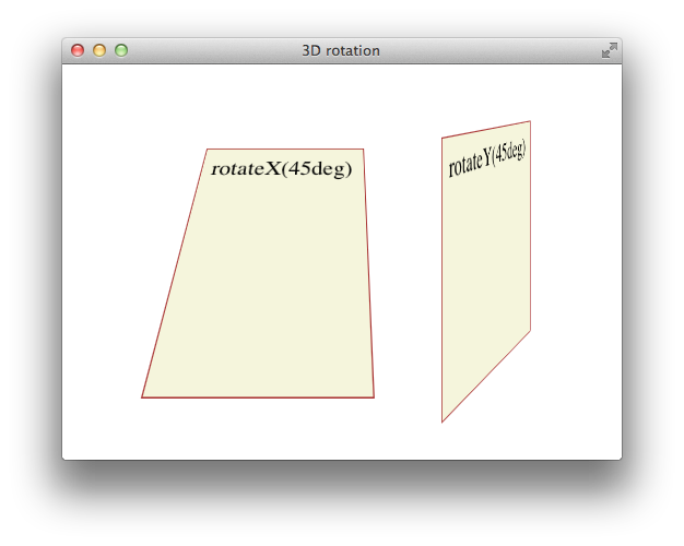
All descendants of an element inherit its 3D rotation. Note that the text in the previous illustration is rotated along with its parent.
Setting Perspective for a Single Element
To create a 3D space with a shared perspective, you need to create a 3D container that has the -webkit-perspective property set; but if you just want to render a single element with the appearance of depth, you can set the -webkit-transform property to a list of transform functions that includes the perspective(distance) function as the first transform. For example:
The foregoing snippet performs two 3D transforms on an element—rotation about the x-axis and perspective distortion, as if the user were viewing the object from 10 cm in front of the screen.
In almost all cases, it is better to create a 3D container and set the -webkit-perspective property for the container element than it is to apply the perspective() transform to an element directly. See Figure 7-7 for details.
Back Face Visibility
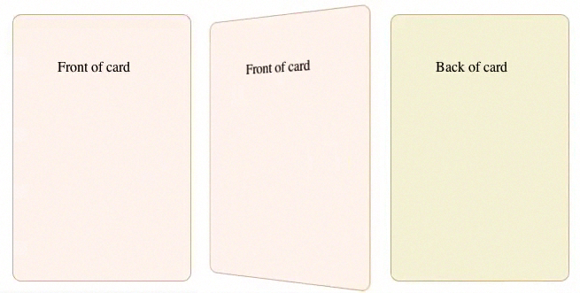
If an element is rotated 90 degrees or more around the x- or y-axis, the back face of the element faces the user. The back face of an element is always transparent, so the user sees a reversed image of the front face through the transparent back face, like a sign painted on a glass door and seen from behind. To prevent the mirror image of the front face from being displayed, set the -webkit-backface-visibility property to hidden . For example:
When -webkit-backface-visibility is set to hidden , an element is not displayed where its back face would be visible. One reason to do this is to create the illusion that an element has two faces, each with its own content. For example, to create the illusion of a card with different contents on the front and back face, two elements are positioned back to back in the same location. The two elements are then rotated together, progressively hiding the front element and revealing the back element. If the back face of the top element were visible, it would obscure the element beneath it instead of revealing the element beneath it as it rotates. Listing 7-8 creates the illusion of a card with content on both sides, as Figure 7-12 shows.
Listing 7-8 Hiding the back side of a card
Using Transformation Matrices
A transformation matrix is a small array of numbers (nine numbers for a 2D matrix, sixteen for a 3D matrix) used to transform another array, such as a bitmap, using linear algebra. Safari provides convenience functions for the most common matrix operations—translation, rotation, and scaling—but you can apply other transforms, such as reflection or shearing, by setting the matrix yourself.
2D Matrix Operations
For a 2D transform, set the -webkit-transform property to matrix(a,b,c,d,e,f) , where the matrix position of the parameters is in column order, as Figure 7-13 shows. The first column in the matrix is the x vector; the second column is the y vector.

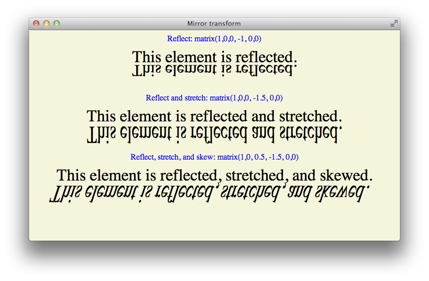
To make full use of transformation matrices, you need an understanding of linear algebra. But even without an understanding of linear algebra, you can often look up the matrix values for a particular effect. For example, here are the settings for reflection around the x- and y-axes:
Reflection around the y-axis— -webkit-transform: matrix(-1,0,0,1,0,0);
Reflection around the x-axis— -webkit-transform: matrix(1,0,0,-1,0,0);
Here are the matrix parameter settings for some common effects:
translate(x, y) = matrix(1, 0, 0, 1, x, y)
scale(x, y) = matrix(x, 0, 0, y, 0, 0)
rotate(a) = matrix(cos(a), sin(a), -sin(a), cos(a), 0, 0)
skewx(a) = matrix(1, 0, tan(a), 1, 0, 0)
skewy(a) = matrix(1, tan(a), 0, 1, 0, 0)
An example of using matrix settings to mirror, stretch, and skew elements is given in Listing 7-9 and is illustrated in Figure 7-14 .
Listing 7-9 Matrix example
3D Matrix Operations
For a 3D transform, set the -webkit-transform property to matrix3d(a,b,c,d,e,f,g,h,i,j,k,l,m,n,o,p) , where the parameters are a homogeneous 4 x 4 matrix in column-major order. This means that the a , b , c , and d parameters, for example, line up as the first column in a 4 x 4 matrix, as Figure 7-15 shows. The first column is the x vector, the second column is the y vector, and the third column is the z vector.
Following are some common parameter settings for 3D transforms:
Identity matrix— matrix3d(1,0,0,0,0,1,0,0,0,0,1,0,0,0,0,1)
Translate matrix— matrix3d(1,0,0,tX,0,1,0,tY,0,0,1,tZ,0,0,0,1)
Scale matrix— matrix3d(sX,0,0,0,0,sY,0,0,0,0,sZ,0,0,0,0,1)
RotateX(a) matrix— matrix3d(1,0,0,0,0,cos(a),sin(a),0,0,sin(-a),cos(a),0,0,0,0,1)
RotateY(a) matrix— matrix3d(cos(a),0,sin(-a),0,0,1,0,0,sin(a),0,cos(a),0,0,0,0,1)
Working with Transforms in JavaScript
There are a few things to be aware of when using JavaScript to control transforms.
The CSS names for transform properties are different than the JavaScript names. When using JavaScript to set a property, delete the hyphens from the property name and capitalize the first letter of the following word. The following snippet shows how to set properties for an element with the ID “myElement” in CSS and JavaScript:
You cannot set a transform property to two consecutive states in a single JavaScript execution cycle . As with all CSS properties, transforms are not applied until the current JavaScript context finishes execution. If you need to set a property to consecutive states, break the code into separate functions and set a timeout; this allows the context to complete. For example, suppose you want to animate a rotation from 0-360 degrees repeatedly. You might do this by disabling the animation, setting the rotation to 0deg , enabling the animation, and setting the rotation to 360deg . Unless you end the JavaScript context between the two settings, the code will not work. The following snippet shows how to accomplish the task:
If you dynamically trigger transformation of an already-transformed element, the old transforms are lost. You must set the style.webkitTransform property to a list of all the transforms necessary to bring the element from its native position and orientation to the desired state. Example: Animated Rotating Box Under JavaScript Control gives an example of the necessary steps in the buttons that open and close the lid of the box.
Transforming an element in an onclick handler may move the element behind other elements so that touch or mouse events are intercepted by those other elements. One solution is to include touch and mouse handlers on any elements that the desired target element may be transformed behind.
If you set the -webkit-transform property using a list of transform functions as parameters, the functions may be combined into a matrix before being applied. Combining transform functions into a matrix normalizes rotation settings modulo 360 so that a setting of 720deg , for example, is normalized to 0deg . You can avoid this behavior by using the same set of transform functions every time you transform the element.
You can use the webkitTransform property to get an element’s transform . Use the window.getComputedStyle() method to obtain the property, as shown in the following snippet:
The webkitTransform property is a string representation of a list of transform operations. Usually this list contains a single matrix transform operation. For 3D transforms, the value is "matrix3d(...)" with the 16 values of the 4 x 4 homogeneous matrix between the parentheses. For 2D transforms, the value is a "matrix(...)" string containing the six vector values.
Example: Animated Rotating Box Under JavaScript Control
The following listing illustrates several of the points covered in Working with Transforms in JavaScript . The result is illustrated in Figure 7-16 .
Copyright © 2016 Apple Inc. All Rights Reserved. Terms of Use | Privacy Policy | Updated: 2016-10-27
Sending feedback…
We’re sorry, an error has occurred..
Please try submitting your feedback later.
Thank you for providing feedback!
Your input helps improve our developer documentation.
How helpful is this document?
How can we improve this document.
* Required information
To submit a product bug or enhancement request, please visit the Bug Reporter page.
Please read Apple's Unsolicited Idea Submission Policy before you send us your feedback.
DEV Community
Posted on Nov 25, 2019
Broken Layered Opacity And Transform Rotation
When developing my Memory Matching game, I came across both of these issues within a few minutes of each other. Here's how I solved the issues with Layered Opacity (in general), then Transform Rotation (in the Safari browser).
- The opacity issue was in all browsers (that I tested).
- The issue with transform rotation was only in Safari (that I tested).
Thanks to some amazing people on Stack Overflow, I got the issues resolved rather quickly ...
Issue with Layered Opacity
Basically, I had set opacity to 0.85 on the "modal" that I was creating. I decided to create a 0.5 opacity wrapper that covered the remainder of the screen (this is something that I've done MANY times on several projects without issue) ... that's where the problem occurred.
What I got was a 0.5 opaque wrapper with an equally opaque modal ... not what I wanted .
A quick search found ...
The problem you probably have (based on looking at your selectors) is that opacity affects all child elements of a parent:
http://jsfiddle.net/Kyle_/TK8Lq/
But there is a solution! Use rgba background values and you can…
Problem solved ...
... got the app working the way I wanted. Then I pushed to production and notified the world that I had a new game for people to try out. Loaded it onto my son's android ... while my wife loaded it on her iOS phone.
"It doesn't work," said my wife.
Me, "it doesn't work?" It works on my linux machine. It works on Android.
Me again, "What's it doing?"
After some careful questioning, the card-flip wasn't working. I then loaded the app onto my iOS phone so that I could say, "It works on my phone."
It didn't work on my phone ...
Issue with Transform Rotate
This whole project started with an article I came across that showed how to execute a card-flip with CSS: Card Flip . The visual was exactly what I was looking for.
Everything was going well and my application doing what I expected.
Then, I tried to load the Progressive Web Application (PWA) on my phone ... and the card-flip broke. A rotation occurred, just showing the same image on both sides.
Another search came up with this ...
Working in Safari 10.1.1, I am given the error that I must use the -webkit- prefix for backface-visibility . You can see this in the browser's console, when you inspect an element (right-click inspect). There is a little yellow triangle with an exclamation point next to it next to backface-visibility …
Problem solved.
Had my wife load the app and verify that it was working. Reloaded it on my son's phone to verify I hadn't broken something else.
Notifications updated to tell everyone it was working correctly.
Wrote this article ...
Top comments (0)
Templates let you quickly answer FAQs or store snippets for re-use.
Are you sure you want to hide this comment? It will become hidden in your post, but will still be visible via the comment's permalink .
Hide child comments as well
For further actions, you may consider blocking this person and/or reporting abuse

Migrating from Class Components to Functional Components in React
Anton Martyniuk - Jun 4

How to Install and Configure Cloudflared on Linux
Sh Raj - Jun 3

12 Benefits Of Learning Python 🐍
developedbyjk - May 25

Best Practices for Writing Clean and Maintainable Html, Css, and JavaScript Code
Kingsley Uwandu - Jun 3

We're a place where coders share, stay up-to-date and grow their careers.
- Español – América Latina
- Português – Brasil
- Tiếng Việt
Finer grained control over CSS transforms with individual transform properties
Transform elements with the translate , rotate , and scale properties

The CSS transform property
To apply transforms to an element, use the CSS transform Property . The property accepts one or more <transform-function> s which get applied one after the other.
The targeted element is translated by 50% on the X-axis, rotated by 30 degrees, and finally scaled up to 120%.
While the transform property does its work just fine, it becomes a bit tedious when you want to alter any of those values individually.
To change the scale on hover, you must duplicate all functions in the transform property, even though their values remain unchanged.
The individual transform properties
Shipping with Chrome 104 are individual properties for CSS transforms. The properties are scale , rotate , and translate , which you can use to individually define those parts of a transformation.
By doing so, Chrome joins Firefox and Safari which already support these properties.
Browser Support
Rewriting the preceding transform example with the individual properties, your snippet becomes this:
Order matters
One key difference between the original CSS transform property and the new properties is the order in which the declared transformations get applied.
With transform , the transformation functions get applied in the order they’re written–from left (outside) to right (inside).
With the individual transformation properties, the order is not the order in which they are declared. The order is always the same: first translate (outside), then rotate , and then scale (inside).
That means both of the following code snippets give the same result:
In both cases the targeted elements will first be translated by 50% on the X-axis, then rotated by 30deg , and finally scaled by 1.2 .
If one of the individual transform properties are declared along with a transform property, then the individual transforms get applied first ( translate , rotate , and then scale ) with the transform last (inside). More details are in the spec that defines how the transformation matrix should be calculated .
The main reason these properties were added is to make animations easier. Say you want to animate an element as follows:
Using transform
To implement this animation using transform , you’d have to calculate all in-between values for all defined transformations, and include those in each keyframe. For example, to do a rotation at the 10% mark, the values for the other transformations must be calculated as well, because the transform property needs all of them.
The resulting CSS code becomes this:
Using individual transform properties
With individual transform properties this becomes much easier to write. Instead of dragging all transformations from keyframe to keyframe, you can target each transform individually. You also no longer need to calculate all those in-between values.
Using individual transform properties and several keyframes
To make your code modular you can split up each sub-animation into its own set of keyframes.
Thanks to this split you can apply each separate set of keyframes as you like because the transform properties–which now have become individual properties–no longer overwrite each other. Above that you can give each transformation a different timing without needing to rewrite the whole lot.
Performance
Animations using these new properties are just as efficient as animations of the existing transform property.
Animations of translate , rotate , and scale run on the compositor the same way that animations of transform do, so they’re good for animation performance in the same way that transform is .
These new properties also work with the will-change property. In general, it’s best to avoid overusing will-change by using it on the minimum number of elements needed, and for as short an amount of time as reasonably possible. But it’s also good to be as specific as possible. For example, if you’re using will-change to optimize an animation with the rotate and filter properties, you should declare this using will-change: rotate, filter . This is slightly better than using will-change: transform, filter in a case where you’re animating rotate and filter , because some of the data structures that Chrome creates in advance when you use will-change are different for transform versus rotate .
Part of the Newly interoperable series
Except as otherwise noted, the content of this page is licensed under the Creative Commons Attribution 4.0 License , and code samples are licensed under the Apache 2.0 License . For details, see the Google Developers Site Policies . Java is a registered trademark of Oracle and/or its affiliates.
Last updated 2022-08-02 UTC.

CSS: Animation Using CSS Transforms
Tweet 16 Shares 0 Tweets 41 Comments
All of the examples on this page should now work now in Firefox, Safari, Chrome, Opera and Internet Explorer 10+. In older browsers you will see either no effects, or the transforms taking place without any animation. Browser-specific prefixes are no longer required.
The animations presented below involve setting up a transformation to take place in response to a mouseover or other event. Then, rather than applying the effect instantly, we assign a transition timing function which causes the transformation to take place incrementally over a set time period.
There are also other kinds of animation available, including @keyframes for perpetual motion, and requestAnimationFrame which gives complete control over the timing and path. These are covered in separate articles.
Browser support
Several browsers introduced support for transforms before the specification was finalised, using a range of browser-specific prefixes. For Safari, Firefox, Opera and Internet Explorer the required prefixes were -webkit- , -moz- , -o- and -ms- .
Internet Explorer 10 and higher supports transitions with no prefix. In IE10 Preview the -ms- prefix was required for transitions. Transforms in all versions of IE10 still require the prefix.
To support these older browsers, the following styles should be used for transitions:
- -webkit-transition
- -moz-transition
- -o-transition
and for transforms:
- -webkit-transform
- -moz-transform
- -o-transform
- -ms-transform
As all modern browsers now support transforms and transitions using the official prefix-less syntax we have removed prefixes from most of the sample code below, but still use them in the background.
Introducing CSS Transformations
The effect of a CSS Transform is to modify the appearance of an element in the browser by translation, rotation or other means. When defined in a style sheet, transformations are applied as the page is rendered, so you don't actually see any animations taking place. Transforms can also be applied as a :hover effect which you can see in the next section.
Apple's proposal for CSS Transformations calls for the ability to change the perspective and work in three dimensions, but that's some way away yet. Even the features demonstrated here won't appear in other browsers until they're approved by the standards body who are still quibbling over CSS3 modules .
Below we've placed four identical DIV's styled as a 100 x 60 pixel box with a 2 pixel border. Subsequently, each element has been transformed in some way using the transform property:
The HTML and CSS code for this example is as follows:
Without the translations, and the red border on the second box, you would see just four identical boxes labelled one through four. What you see in supported browsers (Safari, Chrome, Firefox, Opera), however, will be more like this:
Of note is the fact that the text is still selectable in transformed elements, even when rotated, and that scaling an element affects properties including border widths and font sizes and not just the box dimensions.
Animating your Transforms
While CSS Transformation in itself is a powerful tool for developers (though I shudder to think what will happen as it becomes more widely used), the ability to animate the same effects using transition is far more exciting. Move your mouse over the following four boxes for a demonstration:
What you see above is the four boxes from the previous section in their default states. When you mouseover any of the boxes, however, the CSS transformation is applied as a one second animation. When the mouse moves away the animation reverses, taking each box back to its original state.
And we can do this without using JavaScript - only HTML and CSS! Here is the complete code for 'box 1' which slides to the right and back:
If you think that's cool, realise that CSS Animation can be applied not just to the transforms, but also to other CSS properties including: opacity, colour and a bunch of others.
In the next example the box on the left begins as small and green with square corners, while the one on the right is larger, with a red border and rounded corners. Hovering over either of the boxes will trigger an animation that makes box 1 take on the appearance of box 2 and vice versa.
Again, we're still only using HTML and CSS to make this happen. Without CSS Transforms the two boxes will still change their border-color , and possibly also the border-radius , but it happens immediately rather than as a one second animation.
For more advanced examples you can read our new article on using JavaScript to trigger the animation . And for an alternative to CSS transitions, and finer control over the animation paths and timing, you can use Window.requestAnimationFrame .
Multiple Transforms on one element
To apply more than one transformation to a single element simply list them one after another separated by spaces. The submenu for example at the top right of this page has the following styles:
This means that when you hover over the submenu, it will change colour, rotate and double in size over a period of one second as shown here:
These effects are now available in the latest public release of Safari, so in principle all OSX users will be able to see these effects. Whether it's a good idea to add them to your website I'll leave up to you.
Animations in action
Now here's another example of the kind of fun we can have in combining different effects into single animation. Perhaps you can already work out what's going to happen based on the CSS?
and the HTML:
Put them together and this is the what you get:
If you're using Safari 3 you may notice some problems with the animation, particularly when it reverses after you move the mouse away, but in the latest version of WebKit it's already much smoother. Also the animation in Opera is a bit erratic, with not all the elements being animated.
The dotted outline that appears during the animation shows the placement of the DIV containing the rocket image. This DIV translates across the screen while the image inside is rotated. Simple!
For the browser-impaired what's happening is that when you move the mouse over the space background, the rocket translates from the bottom left to the top right over a period of 3 seconds ( translate() ) and also rotates 70 degrees in a clockwise direction over the first 2 seconds ( rotate() ). The effect is rudimentary, but shows potentional.
To have more control over the animation paths and timing, you can set up WebKit Keyframes . They also allow the animations to run automatically and continuously rather than just in response to mouse events.
Multiple timing functions
In this example we are applying four different transitions using four different timing functions.
When you :hover over the area to the right the blue box will spin, change color from red to blue and move from the top left of the containing box to the bottom right over two seconds.
The first thing you will notice is that that the movement of the box appears to be curved rather than straight. That's because we've used the ease-out timing function for the horizontal translation and ease-in for the vertical.
To properly animate objects over a curved path , or even an arbitrary path, you will need to use JavaScript to control the animation.
During the animation, the colour change from blue to red takes place over the first second of the two second transition, followed by the rotation which takes place over the second second.

The trick to this is that instead of defining the transition as a single property, you can break it up into component parts. We've also made use of transition-delay which allows you to set the starting point of different effects.
Here are the relevant CSS statements:
The rules affecting the background colour transition have been highlighted. They take place over the first second (0s delay, 1s duration). The rotation transform takes place in the next second (1s delay, 1s duration).
Unlike other browsers Firefox requires units to be specified even for zero values in transition-delay , so 0s, 0s, 0s, 1s will work for the example above. For best practice you should include seconds for all CSS time values.
Hover over one element to affect another
A couple of people have asked about triggering animations in relation to a click or hover event elsewhere on the page. With JavaScript this can be done by using an event handler to set or change the className of the element to be animated, and to have a transformation or keyframes associated with the new class.
Using CSS there are some options for targeting related elements. These involve selectors such as the > (child), + (adjacent sibling) and ~ (general sibling) combinators .
The preceding examples all required a direct hover event either on the element itself or on its container, wheras in this example the blue box is animated only when you hover over its sibing, the red box:
The relevant CSS code is as follows. Note that we are using the + adjacent sibling combinator to target #box2 when #box1 experiences a hover event. The ~ combinator may be more flexible in letting you target elements that are further away from the triggering element (some examples ).
Internet Explorer 11 fails trying to animate when the values have been assigned using calc() . You will need to use a fixed value instead if you want to support MSIE 11. It is also not possible to animate from left: 0 to right: 0 .
Of course we can still animate the first box at the same time as targeting its sibling or siblings:
Just be sure not to move the hovered element out from under the pointer or the animation will stop/reverse.
These examples work more or less as intended in WebKit (Safari, Chrome), Firefox and Opera browsers. They also work in Internet Explorer 10.
Controlling the reverse animation
In all the examples above you may have noticed some strange effects when the animation is reversed - particularly when the mouse moves away from the trigger area before the animation has completed.
The box in the animation below will rise up slowly and then shoot off to the right useing an extreme cubic-bezier timing function , making it start off quickly and then slow down at the end.
The CSS for the above example is as follows:
Note that when you move your mouse away the box will not track back over the same path. Instead the vertical animation will come first followed by the horizontal dash. For a solution to this keep reading below.
As alluded to above it is possible to control the animation in both directions. In this case causing the animation to perform everything in reverse:
The trick is to move to original transition settings to the :hover statement and for the 'non-hover' to use a transition that reverses them:
This can be useful for button and menu effects to make an element on the page appear quickly and then fade out slowly, or vice versa.
Remember that the transitions set in the :hover statement are the ones that will be used as the hover state is applied. The 'default' transition settings will be used when returning to the default state.
Translations
- Czech by Alex Novak from bizow.com
- Surfin' Safari - CSS Transforms
- Surfin' Safari - CSS Animation
Related Articles - Transforms and Transitions
- CSS Animation Using CSS Transforms
- CSS Transition Timing Functions
- CSS Infinite Animated Photo Wheel
- CSS Bouncing Ball Animation
- CSS 3D Transforms and Animations
- CSS Upgraded fading slideshow
- CSS Animated Background Gradients
- CSS An actual 3D bar chart
- CSS Photo Rotator with 3D Effects
- JavaScript Animating objects over a curved path
- JavaScript CSS Animated Fireworks
- CSS Fading slideshow with a touch of JavaScript
- JavaScript Controlling CSS Animations
User Comments
Most recent 20 of 41 comments:
Cara K 24 April, 2022
Im currently looking for a way to animate a single div when clicking on it. :activate only seems to work well for links and I don't want to influence any other divs on the website
Do you have any idea what could be the solution? Thank you!!
Mario G 1 September, 2019
Congratulations vermante for the work you do. I would like to ask a question even if it could seem bale, is it possible to apply the effect: "2. Animating your Transforms" on images? Thank you
harsh 11 August, 2019
Thanks for such a beautiful explanation, could you please suggest what approach should I take, so child elements are positioned using transform property inside parent div now the issue is when the size of the parent is increased the child divs transform value remains same.
I want the position of the child elements to be relative wrt to the parent divs size increasing so that child divs can maintain there positions otherwise they tend to go out of the parent container.
peter 26 January, 2019
Is it possible to move an element ***relative to it's actual position*** purely in CSS?
You can 'move' an element by setting "position: relative;" or "position: absolute;" and then changing the top/right/bottom/left or margin-* CSS styles. A CSS transition-timing-function can then animation the move.
But there's no native function AFAIR to 'move 10px to the right from current position'.
Visitor 16 October, 2015
Thank you so much for this! It's been a great help for us visitors who want to learn Animation using CSS. Btw, can you add more examples? Like a light bulb turning it on and off.
Kaboom 3 December, 2014
Texter und Webdesigner 22 May, 2014
Thanks for that comprhensive explanation! A lot of work done very well! I just don't get how the moving background of the rocket is done... am I just overreading the important line? I just see the code for the moving div and the rotating conent?
There's some extra code for the moving background:
#outerspace { background: #0c0440 url(/images/outerspace.jpg); background-position: left bottom; } #outerspace:hover { background-position: -50% bottom; }
Casey Leask 14 August, 2013
-ms-transition never saw the light of day. See github.com/Compass/compass/commit/2973503013a67b958b579f17 f6850499164536a8 and github.com/Compass/compass/issues/924 for details.
DevMan 20 April, 2013
Mark 9 April, 2013
Take a look at this one to see how far you can go with ONLY css
markqian.com/css3
Christopher Bergin 29 March, 2013
great page. I'll bookmark it for reference and use it whenever I would like to provide simple animation without the need for scripting
markosansa 18 December, 2012
Good code but what's about is browser's compatibility ?
Ben Lozano 2 August, 2012
This is an interesting article. I have to take issue with the fact that you called some of the transitions shown "animations". CSS3 defines "animations" as well as "transitions," and the two are not interchangeable.
Animation: "the rapid display of a sequence of images to create an illusion of movement".
nemo 17 July, 2012
I think it'd be best if you simply specified always using units. Your advice at present suggests using -moz-transition-delay: 0s, 0s, 0s, 1s only.
Since Firefox has unprefixed in nightlies, not using units everywhere means people will do "transition-delay: 0, 0, 0, 1s" and at some point that will break.
The exact reading of the spec seems pretty clear that unitless is not an option - so in fact the syntax you are using is a bug. At some point we'll want to get away from vendor prefixes, so best to fix this now.
So far it's only Firefox that 'drops' the transition-delay value of '0' for having no units specified. The reasoning seems to be that in a potential future short-hand property the '0' could be ambiguous with a numeric value for 'iteration count' or similar.
josinhoka 9 July, 2012
@Luca add this line on firefox and will work fine -moz-transition-duration: 1s;
Hannes Gerlach 16 June, 2012
Hello, I've found your post unbelievable helpful, but there is one question I couldn't figure out after all. In number 6. you explained how to work with hovering and I used it to give extra information while hovering over a adjecent <div>. What I would like would be the option for the information to stay visible for the event that the div is clicked. And for the information to vanish again after clicking for a second time. I imagined that it could work as it works with links( :visited etc. ). Sadly thats not the case. Is there a known possibility or an other mechanic I could try?
Website Design Bangladesh 23 May, 2012
has anyone found a solution to autostart the animation. I've seen a website where clods flow from left to right and doesn't depend on mouse action. apparently the guy didn't use javascript for this. Wondering how he did it!
Lee Marshall 19 May, 2012
I really need to find time to work with these animations/transitions. It's funny when you look back and can see how many times you could have used these in the past.
There's no point in animation just for the heck of it, but for the occasional wow factor.
The ability to reveal text with the animations gives them real world application in web design.
André Reitz 27 April, 2012
Great and detailed post!
Transactions that animates the background position doesn't work on Opera. Just for information.
And it seems to have no alternative solution!
If you guys find out how, please let me know!
Azuki 23 March, 2012
This is a great tutorial. Thanks for breaking it down so well!
I have a question about #6 above (Hover over one element to affect another). In your example, is there a way to also trigger an animation for Box#1 while also still animating Box#2?
I've tried using the combinators ~ and + without success (both elements are siblings of the same parent div). I'd really appreciate any ideas you have about accomplishing this in CSS!
show all 41 comments
- Skip to main content
- Skip to search
- Skip to select language
- Sign up for free
Baseline 2022
Since August 2022 , this feature works across the latest devices and browser versions. This feature might not work in older devices or browsers.
- See full compatibility
- Report feedback
The rotate CSS property allows you to specify rotation transforms individually and independently of the transform property. This maps better to typical user interface usage, and saves having to remember the exact order of transform functions to specify in the transform property.
An <angle> specifying the angle to rotate the affected element through, around the Z axis. Equivalent to a rotate() (2D rotation) function.
The name of the axis you want to rotate the affected element around ( "x" , " y ", or " z" ), plus an <angle> specifying the angle to rotate the element through. Equivalent to a rotateX() / rotateY() / rotateZ() (3D rotation) function.
Three <number> s representing an origin-centered vector that defines a line around which you want to rotate the element, plus an <angle> specifying the angle to rotate the element through. Equivalent to a rotate3d() (3D rotation) function.
Specifies that no rotation should be applied.
Formal definition
Formal syntax, rotating an element on hover.
The following example shows how to use the rotate property to rotate an element along various axes on hover. The first box rotates 90 degrees on the Z axis hover, the second rotates 180 degrees on the Y axis on hover, and the third rotates 360 degrees on hover around a vector defined by coordinates.
Specifications
Browser compatibility.
BCD tables only load in the browser with JavaScript enabled. Enable JavaScript to view data.
Note: skew is not an independent transform value
The forums ran from 2008-2020 and are now closed and viewable here as an archive.
Home › Forums › CSS › [Solved] CSS transform not working in Safari
- This topic is empty.
- Author Posts

I am trying to move a search box widget on a WordPress page by using translate (since it be put there by default). The code below works on all of the major browsers except Safari both the desktop and mobile versions. The code is below:
-ms-transform: translateY (85px); -webkit-transform: translateY (85px); -moz-transform: translateY (85px); -o-transform: translateY (85px); transform: translateY(85px); z-index: 1000; position: relative; display: inline-block;
Thanks for any help.

We’d need to see it…also clarify which version of Safari.
You might try
Just for completeness though.
Wait…
Removed the spaces….
edit: Paulie_D was much faster to recognize it :)
Actually, I spotted the same question & answer on StackOverflow and copied it here for comepleteness.
- The forum ‘CSS’ is closed to new topics and replies.
Current time by city
For example, New York
Current time by country
For example, Japan
Time difference
For example, London
For example, Dubai
Coordinates
For example, Hong Kong
For example, Delhi
For example, Sydney
Geographic coordinates of Elektrostal, Moscow Oblast, Russia
City coordinates
Coordinates of Elektrostal in decimal degrees
Coordinates of elektrostal in degrees and decimal minutes, utm coordinates of elektrostal, geographic coordinate systems.
WGS 84 coordinate reference system is the latest revision of the World Geodetic System, which is used in mapping and navigation, including GPS satellite navigation system (the Global Positioning System).
Geographic coordinates (latitude and longitude) define a position on the Earth’s surface. Coordinates are angular units. The canonical form of latitude and longitude representation uses degrees (°), minutes (′), and seconds (″). GPS systems widely use coordinates in degrees and decimal minutes, or in decimal degrees.
Latitude varies from −90° to 90°. The latitude of the Equator is 0°; the latitude of the South Pole is −90°; the latitude of the North Pole is 90°. Positive latitude values correspond to the geographic locations north of the Equator (abbrev. N). Negative latitude values correspond to the geographic locations south of the Equator (abbrev. S).
Longitude is counted from the prime meridian ( IERS Reference Meridian for WGS 84) and varies from −180° to 180°. Positive longitude values correspond to the geographic locations east of the prime meridian (abbrev. E). Negative longitude values correspond to the geographic locations west of the prime meridian (abbrev. W).
UTM or Universal Transverse Mercator coordinate system divides the Earth’s surface into 60 longitudinal zones. The coordinates of a location within each zone are defined as a planar coordinate pair related to the intersection of the equator and the zone’s central meridian, and measured in meters.
Elevation above sea level is a measure of a geographic location’s height. We are using the global digital elevation model GTOPO30 .
Elektrostal , Moscow Oblast, Russia
IMAGES
VIDEO
COMMENTS
Transform: rotate doesn't work in Safari. Ask Question Asked 6 years, 11 months ago. Modified 6 years, 11 months ago. Viewed 19k times 8 I want to create a flipbox which rotate from front to back - on the front side there is a text and also on the back side.The problem is that even though it rotates, both texts from front and back side are ...
Transform: rotate doesn't work in Safari. 2. CSS transform with parent transform does not work on iOS Safari. 0. CSS Animation rotate3d not working in Safari. 1. CSS transform not working properly in Safari, even with -webkit-prefix. Hot Network Questions Is it a bad idea to design a purposefully inconsistent magic system?
The rotate() CSS function defines a transformation that rotates an element around a fixed point on the 2D plane, without deforming it. ... CSS Transforms Module Level 1 # funcdef-transform-rotateBrowser compatibility. BCD tables only load in the browser. See also. transform property; rotate property <transform-function> rotate3d() ...
The WebKit blog details how to use individual CSS Transform properties in the latest version of Safari Technology Preview. This brings the browser in line with the CSS Transforms Module Level 2 spec, which breaks out the translate(), rotate() and scale() functions from the transform property into their own individual properties: translate, scale, and rotate.
.element { transform: rotate(25deg); } This rotates an element clockwise from its original position, whilst a negative value would rotate it in the opposite direction. Here's a simple animated example where a square continues to rotate 360 degrees every three seconds: ... Use -moz-transform for Mozila FireFox, -webkit-transform for Safari ...
A transform can cause part of an element to be displayed in the element's overflow area. If the value of the overflow property is scroll or auto, scroll bars appear as needed if a transform renders part of an object outside the display area. Safari supports both 2D and 3D transforms. Both 2D and 3D transforms are W3C drafts.
If you look at the browser support closely, you may want to consider a fallback solution that works with other browsers until rotate property gets full browser support. The transform property is a viable fallback alternative for an independent transform property, such as rotate.. For example, we could drop the rotate animation into an @supports block. This way, the animation only runs if the ...
Here's how I solved the issues with Layered Opacity (in general), then Transform Rotation (in the Safari browser). To clarify. The opacity issue was in all browsers (that I tested). The issue with transform rotation was only in Safari (that I tested). Thanks to some amazing people on Stack Overflow, I got the issues resolved rather quickly ...
Note: Not all transformation functions have a matching individual property, for example skewX() and matrix(). Rewriting the preceding transform example with the individual properties, your snippet becomes this:.target { translate: 50% 0; rotate: 30deg; scale: 1.2; } Order matters. One key difference between the original CSS transform property and the new properties is the order in which the ...
using transform: rotate(359deg); All other browsers rotate clockwise 359°. Safari doesn't budge. Then i realized it was moving, just rotating 1° counter clockwise. Any degree value I give it, Safari takes the shortest route. So, 90° = clockwise, 270° = counter clockwise, etc….
How to scale, rotate, translate and transform elements using new CSS hover effects that work now in Safari, Webkit and Chrome ... For Safari, Firefox, Opera and Internet Explorer the required prefixes were -webkit-, -moz-, -o-and -ms-. Internet Explorer 10 and higher supports transitions with no prefix.
.one {transform: translateX (200px) rotate (135deg);}.two {transform: rotate (135deg) translateX (200px);} Result. When an element is rotated before being translated, the translate direction is on the rotated axis. The axis as indicated with the dotted lines. More examples. Please see Using CSS transforms and <transform-function> for more examples.
Map of the Moscow Oblast. The Joseph-Volokolamsk Monastery in Volokolamsk. Flag Coat of arms. Moscow Oblast (Russian: Моско́вская о́бласть, Moskovskaya oblast) is a federal subject of Russia.It is located in western Russia, and it completely surrounds Moscow.The oblast has no capital, and oblast officials reside in Moscow or in other cities within the oblast.
The name of the axis you want to rotate the affected element around ( "x", " y ", or " z" ), plus an <angle> specifying the angle to rotate the element through. Equivalent to a rotateX() / rotateY() / rotateZ() (3D rotation) function. Three <number> s representing an origin-centered vector that defines a line around which you want to rotate the ...
In 1938, it was granted town status. [citation needed]Administrative and municipal status. Within the framework of administrative divisions, it is incorporated as Elektrostal City Under Oblast Jurisdiction—an administrative unit with the status equal to that of the districts. As a municipal division, Elektrostal City Under Oblast Jurisdiction is incorporated as Elektrostal Urban Okrug.
October 16, 2014 at 7:43 am #186388. Matt Fletcher. Participant. I am trying to move a search box widget on a WordPress page by using translate (since it be put there by default). The code below works on all of the major browsers except Safari both the desktop and mobile versions. The code is below: input#s {. -ms-transform: translateY (85px);
Elektrostal. Elektrostal ( Russian: Электроста́ль) is a city in Moscow Oblast, Russia. It is 58 kilometers (36 mi) east of Moscow. As of 2010, 155,196 people lived there.
On the "back" side element that is translated 180 deg in Y, I added a 1px Z translation and it fixed my Safari bug. transform: rotateY(180deg) translateZ(1px); If the front & back elements are in the same z-index in Safari, this bug seems to be present. There is a CodePen here where you can remove then translateZ(1px) and watch the bug show up ...
Geographic coordinates of Elektrostal, Moscow Oblast, Russia in WGS 84 coordinate system which is a standard in cartography, geodesy, and navigation, including Global Positioning System (GPS). Latitude of Elektrostal, longitude of Elektrostal, elevation above sea level of Elektrostal.
I've just run into a very weird problem that only shows up in Safari 10. I have playing cards, svg images, that are sometimes rotated using transform:rotate(xdeg). The card I'm using has a red block pattern. When it's not rotated, or rotated at right angles, i.e. 90, 180, 270, then it looks normal.