Transforms on SVG Elements

The following is a guest post by Ana Tudor . Ana always does a great job digging into the math behind what we can do graphically on the web. In this case, that’s extra-useful as there are several ways to handle SVG transforms and they require a bit of mathematical thinking, especially converting one type to another for the best cross browser support. Here’s Ana.
Just like HTML elements, SVG elements can be manipulated using transform functions. However, a lot of things don’t work the same way on SVG elements as they do on HTML elements.
For starters, CSS transforms on SVG elements don’t work in IE . Of course, there’s the option of using the SVG transform attributes for IE if we only need to apply 2D transforms on our elements.
Update: Edge supports CSS transforms on SVG elements starting with EdgeHTML 17 released on the 30th of April 2018.
However, if we use the transform attribute approach, all parameters for transform functions are numbers, meaning we cannot control and combine units anymore. For example, we cannot use % values for translate functions (though % values wouldn’t work for CSS transforms in Firefox either, whether we’re talking about transform-origin values or translate() parameters ) and all rotate or skew angle values are in degrees, we cannot use the other units we have available in CSS .
Also problematic is the fact that JavaScript feature detection fails in IE (reading the CSS transform value via JS will return the matrix equivalent of the transform we have set in our stylesheet). This means we either need another way to check for IE or we use the transform attributes across the board (which feels like less work overall).
The main thing that works differently between HTML elements and SVG elements is the local coordinate system of the element. Every element, whether we’re talking about HTML elements or SVG elements, has one.
For HTML elements, this coordinate system originates at the 50% 50% point of the element.
For SVG elements, the origin is, assuming we have no transform applied on the element itself or any of its ancestors inside the <svg> element, at the 0 0 point of the SVG canvas.
The different origins will cause different results following rotate , scale , or skew transforms if the 50% 50% point of the SVG element doesn’t coincide with the 0 0 point of the SVG canvas.
In order to better understand this, let’s see how transform functions work.

How transform functions work
One thing we need to understand about transforms is that they have a cumulative effect when applied on nested elements. This means that a transform applied on an element having descendants also affects all of its descendants along with their own systems of coordinates and the results of any transforms on those descendants. For simplicity, we always assume that in the following cases, our elements don’t have any ancestors with transforms applied on them. We also assume our elements don’t have any descendants.
Translation
A translation moves all the points of an element in the same direction and by the same amount. Translation preserves parallelism, angles and distances. It can be interpreted as shifting the origin of the element’s system of coordinates – when that happens, any element whose position is described with respect to that origin (the element itself and any descendants it may have) gets shifted as well. Its result does not depend on the position of the system of coordinates.
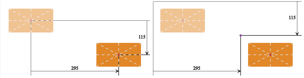
The figure above presents the HTML case (left) versus the SVG case (right). The faded versions are the initial ones (before a translation was applied). Applying a translate transform shifts our elements and their systems of coordinates along with them. It would also shift any descendants if they had any.
As we already know, what differs between the two is the position of the coordinate system. For the HTML case, the origin of the system of coordinates is at the 50% 50% point of the element. For the SVG case, it’s positioned at the 0 0 point of the SVG canvas (we have assumed there are no transforms on any of the element’s possible ancestors inside the <svg> element). However, in a translation, the position of the system of coordinates relative to the element does not influence the final position of the element.
Both for HTML and SVG elements, when using CSS transforms, we have three translation functions available for 2D: translateX(tx) , translateY(ty) and translate(tx[, ty]) . The first two only act on the x and y directions (as given by the element’s system of coordinates) respectively. Note that if another transform is applied before the translate, the x and y directions may not be horizontal and respectively vertical anymore. The third translation function moves the element by tx along the x axis and by ty along the y axis. ty is optional in this case and defaults to zero if not specified.
SVG elements can also be translated using transform attributes . In this case, we only have a translate(tx[ ty]) function. Here the values can also be space-separated, not just comma-separated like in the similar CSS transform function . So in the very simple case where 1 SVG user unit is equivalent to 1px , the following two ways of translating an SVG element are equivalent:
• using a CSS transform:
• using an SVG transform attribute:
The SVG transform attribute and the CSS transform property are going to be merged.
Consecutive translate() transforms are additive, meaning that we can write a chain like translate(tx1, ty1) translate(tx2, ty2) as translate(tx1 + tx2, ty1 + ty2) . Note that this is only true if the two translations are consecutive, without another type of transform chained between the two. Reversing a translation translate(tx, ty) is done via another translation translate(-tx, -ty) .
A 2D rotation moves an element and any descendants it may have around a fixed point (a point whose position is preserved following the transform ). The final result depends on the position of this fixed point. Starting from the same element, two rotations of identical angles around two different points will produce different results. Just like translation, rotation doesn’t distort the element and preserves parallelism, angles, and distances.
Consecutive rotate() transforms around the same fixed point are additive, just like translations, meaning that rotate(a1) rotate(a2) is equivalent to rotate(a1 + a2) (but only if our two rotations are consecutive, without any other type of transform in between them).
Reversing a rotation rotate(a) is done via another rotation of the same angle in the opposite direction rotate(-a) around the same fixed point.

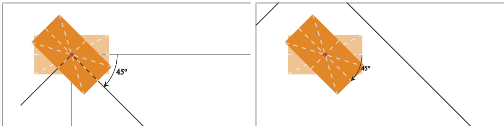
The figure above presents the HTML case (left) versus the basic SVG case (right). The faded versions are the initial ones (before a rotation was applied). Applying a rotation moves the elements and their systems of coordinates around the fixed origins and it would do the same to any descendants of our elements if they had any.
In the HTML case, the origin of the element’s system of coordinates is situated at the element’s 50% 50% point, so everything rotates around this point. In the SVG case, however, the origin is situated at the 0 0 point of the SVG canvas (we have assumed there are no transforms on any of the element’s possible ancestors inside the <svg> element), causing everything to move around that point.
The 2D rotation function is pretty straightforward in the case of the CSS transform property : just rotate(angle) . The angle value can be expressed in degrees ( deg ), radians( rad ), turns ( turn ) or gradians ( grad ). We could also use a calc() value (for example, something like calc(.25turn - 30deg) ), but this only works in Chrome 38+/ Opera 25+ at the moment .
Update: Firefox 59+ also supports using calc() as an angle value for rotate() functions.
If we use a positive angle value, then the rotation is a clockwise one (and, conversely, a negative angle value gives us a counter-clockwise rotation).
In the case of SVG transform attributes , the rotation function is a bit different – rotate(angle[ x y]) . The angle value works in the same way as for the similar CSS transform function (positive value means clockwise rotation, negative value means counter-clockwise rotation), but it has to be a unitless degree value. The optional unitless x and y parameters specify the coordinates of the fixed point we rotate the element (and its system of coordinates) around. If they are both omitted, then the fixed point is the origin of the system of coordinates. Specifying just the angle and the x parameters makes the value invalid and no transform is applied.
Just like in a translate() function, the parameters can be space-separated or comma-separated.
Note that the presence of the x and y parameters does not not mean the origin of the system of coordinates gets moved to that point. The system of coordinates, just like the element itself (and any descendants it may have) simply gets rotated around the x y point.
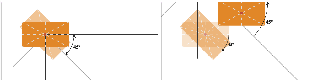
This means that we have two ways of rotating an SVG element (the result can be seen on the right in the previous figure):
We can also specify a transform-origin value in our CSS to emulate the use of the x and y parameters. Length values are relative to the element’s system of coordinates, but percentage values are relative to the element itself, so they seem perfect for what we want were. However, we should keep a couple of things in mind.
First, the CSS transform-origin and the fixed point specified inside the rotate() function are not the same . For a very simple example, let’s say one using just a rotation around the 50% 50% point of the SVG element, this won’t matter. Consider the following two:
They both rotate the element the same way in Chrome, as seen in the following figure:
This shows the difference between the two. When using CSS, the element’s system of coordinates is first moved from the 0 0 point of the SVG canvas to the 50% 50% point of the element. Then, the element is rotated. When using an SVG transform attribute, the element and its system of coordinates are simply rotated around the point specified by the second and third arguments of the rotate() function, a point whose coordinates we’ve computed so that it’s situated at the 50% 50% point of the element. The origin of the element’s system of coordinates is still way outside the element, and that origin is going to influence any subsequent transform depending on it.
In order to better understand this, let’s chain another rotation after the first that rotates the element by 45° in the opposite direction:
As the figure above shows, when using a CSS transform and setting the transform-origin to 50% 50% , the two rotations cancel each other, but when using the SVG transform attribute, the fixed point we rotate the element around differs from one rotation to the other — it’s the 50% 50% point of the element for the first rotation, and the origin of the element’s system of coordinates for the second. In this situation, we need to use rotate(-45 140 105) instead of rotate(-45) to reverse the rotation.
However, this does not change the fact that we only have one transform-origin (because the element’s system of coordinates only has one origin), but when using the SVG transform attribute, we can apply multiple rotations, each and every one of them rotating the element around a different point . So, if we want to first rotate our rectangle by 90° around its bottom right corner, and then by 90° more around its top right corner, that’s easy with an SVG transform attribute — we just specify a different fixed point for each rotation.

But how can we get the same effect with CSS transforms? It’s easy for the first rotation because we can set the transform-origin to right bottom , but what about the second rotation? If we simply chain it after the first, it’s just going to rotate the element by 90° more around the same fixed point ( right bottom ).
We need three chained transforms in order to rotate an element around a fixed point regardless of where its transform-origin is. The first one is a translate(x, y) transform that moves the origin of the element’s system of coordinates such that it coincides with the fixed point we want to rotate everything around. The second one is the actual rotation. And, finally, the third one is a translate(-x, -y) — the reverse of the first translation.
In this case, our code would be:
The figure below shows how this works, step by step:
The second problem with transform-origin is that only length values work in Firefox. Percentages and keywords don’t, so we would have to replace them with length values. And, percentage values used inside translate() transforms also don’t work in Firefox.
Update: percentage values now work as transform-origin values in Firefox as well, but they don’t behave the same way they do in Chrome. Moreover, Firefox appears to be right in this case, so don’t use this method!
Scaling changes the distance from the origin of the element’s system of coordinates to any point of the element (and of any descendants it may have) by the same factor in the specified direction. Unless the scaling factor is the same in all directions — in which case we have uniform (or isotropic ) scaling — the shape of the element is not preserved.
A scaling factor within the (-1, 1) range makes the element contract, while a scaling factor outside this range will enlarge it. A negative scaling factor will also perform a point reflection about the origin of the element’s system of coordinates in addition to a size modification. If only one scaling factor is different from 1 , then we have directional scaling.
The result of a scale transform depends on the position of the origin of the system of coordinates. Starting from the same element, two scale transforms of the same factor will produce different results for different origins.

The figure above presents the HTML case (left) versus the SVG case (right). In both cases, we scale the element using a scale factor of sx along the x axis and a factor of sy along the y axis. What differs is the position of the origin of the element’s system of coordinates, situated at the 50% 50% point of the element in the HTML case and at the 0 0 point of the SVG canvas (we have assumed there are no transforms on any of the element’s possible ancestors inside the <svg> element) in the SVG case.
When using the CSS transform property , we have three scaling functions available for 2D: scale(sx[, sy]) , scaleX(sx) and scaleY(sy) . The first scaling function scales the element by sx along the x axis and by sy along the y axis. The sy parameter is optional and, if not specified, it is assumed to be equal to sx , thus making the scale isotropic. sx and sy are always unitless values. The other two functions only act on the x and the y direction (as given by the element’s system of coordinates) respectively. scaleX(sx) is equivalent to scale(sx, 1) , while scaleY(sy) is equivalent to scale(1, sy) . If another transform is applied before the scale, the x and y directions may not be horizontal and respectively vertical anymore.
In the case of the SVG transform attribute , we only have a scale(sx[ sy]) function. Again, here the values can also be space-separated, not just comma-separated like in the similar CSS transform function.
So for SVG elements, the following two methods of scaling them are equivalent:
• using a CSS transform
• using an SVG transform attribute
These both produce the same result, shown in the right half of figure #7. But what if we want the same effect we get when applying this exact scale function to an HTML element? Well, the same way we can do this in rotations.
Using CSS transforms, we have the option of setting the the appropriate transform-origin on our SVG element, or of chaining translates before and after the scale — first we translate the system of coordinates so its origin is at the 50% 50% point of our SVG element, then apply the scale, and then reverse the first translation. Using an SVG transform attribute, we only have the option of chaining transforms. So the code for our case above would be:
• using a CSS transform with transform-origin (don’t do this)
• using chained CSS transforms
• using chained transform functions as the value for an SVG transform attribute
The following demo illustrates just how the chaining method works (click the play ► button to start):
See the Pen Chaining on SVG elements to scale wrt a certain point by Ana Tudor ( @thebabydino ) on CodePen .
Something else to remember about scaling is that two consecutive scale() transforms scale(sx1, sy1) scale(sx2, sy2) can be written as scale(sx1*sx2, sy1*sy2) and reversing a scale(sx1, sy1) transform is done with a scale(1/sx1, 1/sy1) one. If all scale factors in absolute value are equal to 1 , then that scale is its own inverse.
Skewing an element along an axis displaces each of its points (except those being precisely on the skew axis) in that direction by an amount that depends on the skew angle and the distance between that point and the skew axis. This means that only the coordinate along the skew axis changes, while the coordinate along the other axis remains unchanged.
Unlike translation or rotation, skewing distorts the element, turning squares into non-equilateral parallelograms and circles into ellipses. It doesn’t preserve angles (for a skew of angle α , the 90° angles of a rectangular element become 90° ± α ) or the length of any segment not parallel to the skew axis. However, the area of the element is preserved.
Unlike translation or rotation, skewing is not additive. Skewing an element along an axis by an angle α1 and then skewing it again along the same axis by another angle α2 is not equivalent to skewing it along that axis by an angle α1 + α2 .
The demo below illustrates how skewing works — change the angle and/or the axis to see how it affects the initial square.
See the Pen How the skew transform works by Ana Tudor ( @thebabydino ) on CodePen .
The skew angle is the angle between the final and initial position of the axis that changes after applying the transform (not the axis along which we skew the element). A positive skew angle in the [0°, 90°] interval adds a value of the same sign as the unchanged coordinate to the initial value of the coordinate that changes (the coordinate along the skew axis), while a negative value in the [-90°, 0°] interval adds a value whose sign opposes that of the fixed coordinate.
If we perform a skew along the x axis, then for any point of our element, the y coordinate of that point remains the same, while the x coordinate changes by an amount d depending on the skew angle and on the fixed y coordinate ( this talk explains how the d amount can be computed around minute 15). The top and bottom edge (and any other segment parallel to the x axis) stay the same length, while the left and right edges get longer as we increase the skew angle, going to infinity in the case of a ±90° angle. Once that value is exceeded, they start getting shorter until we get to a ±180° angle, where they’re back to their initial length.
Note that the result of a skew using an angle α in the (90°, 180°] interval is equivalent to the result of a skew of angle α - 180° (which would end up being in the (-90°, 0°] interval). Also, the result of a skew of an angle α in the (-180°, -90°] interval is equivalent to the result of a skew of angle α + 180° (which would end up being in the [0°, 90°) interval).
If we perform a skew along the y axis, the x coordinate remains the same for any point of our element, while the y coordinate changes by an amount d depending on the skew angle and on the fixed x coordinate. The right and left edge (and any other segment parallel to the y axis) stay the same length, while the top and bottom edges get longer as we increase the skew angle, going to infinity in the case of a ±90° angle. Once that value is exceeded, they start getting shorter until we get to a ±180° angle, where they’re back to their initial length.
Just like with scaling, the result of a skew operation depends on the position of the origin of the element’s system of coordinates. Starting from the same element, two skew transforms of the same angle along the same axis will produce different results for different origins.

The figure above presents the HTML case (left) versus the SVG case (right). In both cases, we skew our elements along the x axis by the same angle. What differs is the position of the origin of the element’s system of coordinates, situated at the 50% 50% point of the element in the HTML case and at the 0 0 point of the SVG canvas in the SVG case. We have assumed there are no transforms on any of the element’s possible ancestors inside the <svg> element in the SVG case.
For simplicity, let’s focus on what happens with just one point of our elements: the top right corner. In both cases, the y coordinate gets preserved — the point does not move vertically, only horizontally. However, we see that, horizontally, this corner moves to the left (the negative direction of the x axis) in the HTML case and to the right (the positive direction of the x axis) in the SVG case. And, the bottom right corner moves to the right following the skew in both the HTML and the SVG case. So, how does this work?
Well, as mentioned before, in a skew along the x axis, the y coordinate of any point stays the same, while to the initial x coordinate of the same point we add an amount d which depends on the skew angle and on the fixed y coordinate. This amount d has the sign of the fixed coordinate y (with respect to the element’s local system of coordinates) if the skew angle is in the [0°, 90°] interval, and the opposing sign if the skew angle is in the [-90°, 0°] interval.
Our angle is 60° in both cases, so the sign of the y coordinate of the top right corner is what makes the difference here. In the HTML case, with the origin of the element’s system of coordinates situated at the 50% 50% point of the element, the y coordinate of the element’s top right corner is negative as the y axis points down. However, in the SVG case, with the origin of the element’s system of coordinates situated at the 0 0 point of the SVG canvas, the y coordinate of the element’s top right corner is positive. This means that in the HTML case, we add a negative amount to the initial x coordinate of the top right corner, causing it to move left, while in the SVG case, we add a positive amount to the initial x coordinate of the top right corner, causing it to move right.
Whether we’re skewing an SVG element using CSS transforms or the SVG transform attribute, we have two functions available: skewX(angle) and skewY(angle) . The first skews the element along the x axis, while the second one skews it along the y axis.
For the CSS transform property , the angle is a value with a unit. It can be expressed in degrees ( deg ), radians ( rad ), turns ( turn ), gradians ( grad ) or even using calc() to combine any of these units (but keep in mind that using calc() with angle units only works in Blink browsers at this point).
When skewing the element with the help of an SVG transform attribute , our angle value is always a unitless degree value.
This means that we have two equivalent ways of skewing an SVG element (the result can be seen on the right in the previous figure):
• using CSS transforms:
If we want the same effect we get when applying this exact skewing function on an HTML element, we have three ways of obtaining it, just like for scaling:
The following demo illustrates just how the chaining method works:
See the Pen Chaining on SVG elements to skew wrt a certain point by Ana Tudor ( @thebabydino ) on CodePen .
Shortening the chain
Alright, chaining transforms does the job. We can rotate, scale and skew SVG elements and they behave just like HTML elements would with those same transforms. And, if we use chained transforms as the value for an SVG attribute, we can even get the result we want in IE. But it’s ugly ! Isn’t there a simpler way of doing this?
Well, if we start with our SVG rectangle positioned with its 50% 50% point at the 0 0 point of the SVG canvas, we can cut one translation out of the chain, reducing our rotation code to:
See the Pen Chaining on SVG elements to rotate wrt a certain point #1 by Ana Tudor ( @thebabydino ) on CodePen .
We could also get rid of the first translation with a properly chosen viewBox attribute on the <svg> element containing our rectangle. The viewBox attribute has four space-separated components. The first two specify the x and y coordinates of the top left corner of the SVG canvas in user units, while the other two specify its width and height in user units. If a viewBox attribute is not specified, the coordinates of the top left corner will be 0 0 .
Below, you can see the difference between an <svg> element with no viewBox specified, and one with viewBox='-140 -105 280 210' :

Coming back to our example, if we set the viewBox such that the 0 0 point of the SVG canvas is positioned where we want to have the 50% 50% point of our rectangle, our code becomes:
See the Pen Setting proper `viewBox` to rotate wrt a certain point #1 by Ana Tudor ( @thebabydino ) on CodePen .
Practical use
Putting the 0 0 point of our SVG canvas and any other element we might want right in the middle makes it easier to work with transforms because it makes the 0 0 point of the SVG canvas coincide with the 50% 50% point of the element we want to transform. The following demo (click to play/pause) shows three four-point stars which are initially positioned in the middle and then rotated, translated, skewed, and scaled without any need for setting a transform-origin or adding additional translations to the chain:
See the Pen SVG Stars – final by Ana Tudor ( @thebabydino ) on CodePen .
Let’s see how this demo works, step by step.
The star itself is a polygon with eight points. The demo below shows how they’re positioned relative to the origin ( 0 0 ) of the SVG canvas. Hover the x,y pairs in the code or the points themselves to see which corresponds to which.
See the Pen 4 point star – the points by Ana Tudor ( @thebabydino ) on CodePen .
We have three such stars. We don’t repeat the code for the polygon 3 times — instead, we put it inside <defs> and <use> it three times later.
The first thing we do is scale our stars from 0 to 1 :
This gives us the following result:
See the Pen SVG Stars – step #1 by Ana Tudor ( @thebabydino ) on CodePen .
The next thing we want to do is add some rotation to our keyframe animation. But we want a different rotation for each star — let’s say a random angle plus a specific angle computed based on the index of the star. This means we can’t keep using the same keyframe animation for all three of them; we need three different animations. This also helps us make the fills different.
You can see the result of this code below:
See the Pen SVG Stars – step #2 by Ana Tudor ( @thebabydino ) on CodePen .
The next step is translating and scaling down our stars:
See the Pen SVG Stars – step #3 by Ana Tudor ( @thebabydino ) on CodePen .
We’re almost there! We just need to skew our stars and use a scale transform to correct their dimensions post-skew.
Here I’ve added more than one new keyframe for precision. While the skew angle changes linearly, the corrective scale factor doesn’t — its value is the cosine of the skew angle and, as the next figure shows, the graph of the cosine function is not a straight line between 0° and 90° .
However, this pure CSS demo is a bit buggy in Firefox and doesn’t work at all in IE since no IE version supports CSS transforms on SVG elements. We can fix all this if we use SVG transform attributes and animate their value changes with JavaScript. You can see the JavaScript version below (click to start).
Wow, great job explaining everything Ana!
As you demonstrated, animation can be pretty challenging due to all the browser inconsistencies. Like you, I concluded that the only way to do it well is by using JS. Interestingly, motion appears smoother that way too particularly on iOS devices compared to CSS.
Curious: have you seen what GSAP is doing to solve these issues? For example, the transform-origin dilemma: https://css-tricks.com/svg-animation-on-css-transforms/
Thanks again for putting together this deep-dive into SVG transforms.
Yesss, I remember that article that article very well, firstly because it came out around the time I started writing this one (checked with GitHub now, tells me October 30, so less than 2 weeks apart… yeah, I’m that bad with writing :P ) and secondly, because it was my first time seeing getBBox() , which I’ve since found immensely useful for positioning text.
I’m more of a tech head, so I’ve never created an SVG in a graphical editor and I think I’ve used a ready made one maybe twice.
I mostly generate them via JavaScript, because I may want something a bit more complex which writing manually would be more insanity than I’m capable of. This normally means that everything is generated following a rule (even if I introduce randomness there, it’s still never going to be something like a horse – sorry, Chris, the horse in your SVG talk is stuck to my brain), often times it involves a lot of very similar components which I just create once inside <defs> , positioned in the middle of the SVG, then use a number of times and position in the right spot with the help of transforms. So for something like geometric shapes I already know everything about all their dimensions and about the transforms I’ll have applied on them even before I add the corresponding use element to the parent SVG, but sometimes I’ll also want some text for something and, in that case, I really need getBBox() because I don’t know that text’s dimensions beforehand and I’ll need to compute positions according to those dimensions so that it’s placed where I want it to.
The text thing used to be my worst SVG nightmare before getting the idea to use that function, so thank you too! :)
Great work, Ana.
(If a picture is worth 1k words, what is the value of an animated explain?)
Awesome article!
Awesome article, great explanation, thank you.
Superb article Ana, I’ve been using GSAP to solve the transform-origin issues with SVG animation, amongst other things for quite a while now. It’s actually nice too understand the inner workings and identify why this problem exists and how we could go about solving these things ourselves without having to rely on a plugin.
GSAP is awesome, but is probably a little heavy if all we’re using it for is to fix the transform-origin on an svg that has a very simple transform animation.
This is the website for my wedding http://yennyetygustavo.com/ , i use SVG images and GSAP animations. Firefox mess up my transform origin, using a little js function i was able to resolve it.
Nice, Gustavo. I just wanted to point out that you’re using a super old version of GSAP that predates all the SVG workarounds we implemented. If you update to the latest version, it’ll handle all the transform-origin stuff including in Firefox…automatically. We explain it in this article: https://css-tricks.com/svg-animation-on-css-transforms/
Demos could be much more illustrative if they apply transformation in order from right to left as it happens in SVG.
This page requires JavaScript.
Please turn on JavaScript in your browser and refresh the page to view its content.
HTML Graphics
Svg tutorial, canvas tutorial, canvas clock, google maps, svg transformations.
SVG elements can be manipulated using transform functions.
The transform attribute can be used with any SVG element.
The transform attribute defines a list of transform functions that can be applied to an element and the element's children:
- translate()
Translate() Function
The translate() function is used to move an object by x and y .
Assume one object is placed with x="5" and y="5". Then another object contains transform="translate(50 0)", this means that the other object will be placed at x-position 55 (5 + 50) and at y-position 5 (5 + 0).
Let's look at some examples:
In this example, the red rectangle is translated/moved to the point (55,5) instead of (5,5):
Here is the SVG code:
In this example, the red rectangle is translated/moved to the point (5,55) instead of (5,5):
In this example, the red rectangle is translated/moved to the point (55,55) instead of (5,5):
Advertisement
Scale() Function
The scale() function is used to scale an object by x and y . If y is not provided, it is set to be equal to x .
The scale() function is used to change the size of an object. It takes two numbers: the x scale factor and the y scale factor. The x and y scale factors are taken as the ratio of the transformed dimension to the original. For example, 0.5 shrinks the object by 50%.
In this example, the red circle is scaled to twice the size with the scale() function:
In this example, the red circle is scaled vertically to twice the size with the scale() function:
In this example, the red circle is scaled horizontally to twice the size with the scale() function:
Rotate() Function
The rotate() function is used to rotate an object by a degree .
In this example, the blue rectangle is rotated with 45 degrees:
SkewX() Function
The skewX() function is used to skew an object along the x axis by a degree .
In this example, the blue rectangle is skewed along the x axis by 30 degrees:
SkewY() Function
The skewY() function is used to skew an object along the y axis by a degree .
In this example, the blue rectangle is skewed along the y axis by 30 degrees:

COLOR PICKER

Contact Sales
If you want to use W3Schools services as an educational institution, team or enterprise, send us an e-mail: [email protected]
Report Error
If you want to report an error, or if you want to make a suggestion, send us an e-mail: [email protected]
Top Tutorials
Top references, top examples, get certified.
SVG transform="rotate(180)" does not work in Safari 11
Answer by brodie velazquez.
In SVG 1.1 <svg> elements did not support transform attributes. In SVG 2 it is proposed that they should.,Chrome and Firefox implement this part of the SVG 2 specification, Safari does not yet do so and IE11 never will.,For some reason element ,Chrome 63 renders it properly.
Browsers allow you to use CSS on the SVG-elements, so an easy fix is to use the CSS transform instead.
Source: https://stackoverflow.com/questions/48248512/svg-transform-rotate180-does-not-work-in-safari-11
Answer by Alijah Cabrera
Chrome 63 renders it properly.,is shown as not rotated in Safari 11. ,For some reason element ,CSS properties that affect type rendering
For some reason element
Source: https://coderedirect.com/questions/165543/svg-transform-rotate180-does-not-work-in-safari-11
Answer by Aitana Mills
In the case of the SVG transform attribute, we only have a scale(sx[ sy]) function. Again, here the values can also be space-separated, not just comma-separated like in the similar CSS transform function.,• using chained transform functions as the value for an SVG transform attribute,Just like in a translate() function, the parameters can be space-separated or comma-separated.,• using an SVG transform attribute
• using a CSS transform:
• using an SVG transform attribute:
First, the CSS transform-origin and the fixed point specified inside the rotate() function are not the same . For a very simple example, let’s say one using just a rotation around the 50% 50% point of the SVG element, this won’t matter. Consider the following two:
Source: https://css-tricks.com/transforms-on-svg-elements/
Answer by Daniella King
Source: https://www.codegrepper.com/code-examples/css/rotate%2Bcss
Answer by Memphis Lucas
The front-end problems we solve tend to be those that are too complex or idiosyncratic to tackle with a framework or a simple content reflow. Our most common use of icons is to reinforce the meaning or relative importance of interface controls (a plus next to the word “Add,” a checkmark next to the word “Okay,” etc.).,By default, icons will base their position, size and color on their parent elements and surrounding text.,This markup tells the browser “use the symbol with ID back from the file icons.svg.” This means our external file is nice and cacheable, and we can reference the same icon asset multiple times from the same file! Hooray!,First (as Elise mentioned) it’s important to handle _decorative_ icons differently from _content_ icons. Purely decorative icons should actually be _hidden_ from AT (with e.g. `role=presentation` and `aria-hidden=true` or `hidden`).
Here’s what our SVG task might look like:
Now that we have our SVG sprite, we can reference it from our markup using <svg> and the <use> element:
We don’t want to style every svg because SVG can be used for a lot more than icons. Instead, we’re going to create a class. Our team likes using SUIT CSS naming conventions , so we’ll name our class Icon :
Back when we were exporting icons, we only exported a single arrow asset ( back.svg ), the contents of which looked something like this:
Let’s pop open our favorite code editor, and create a new forward.svg file to compliment it:
As an example, this error.svg file has fill attributes on the elements themselves:
Arguably the best reason to adopt SVG is to take advantage of its accessibility features. Thanks to Léonie Watson’s Tips for Creating Accessible SVG , we know to add the following elements and attributes to our icons:
Luckily, we can! All we need to do is provide all our titles and descriptions in a separate YAML file :
Then update the Gulp task with the location of that file:
The polyfill will work as-is, but we should make a couple of changes one small change to our task config to avoid any collisions with in-page content:
Source: https://cloudfour.com/thinks/our-svg-icon-process/
Recent Posts

Using CSS Transforms in the Real World
Share this article

Vertically Aligning Children
Creating arrows.
- Creating a “Jumping Ball” Loader
- Creating a “Spinner” Loader with SVG
Creating a Flip Animation
A word of caution, frequently asked questions about css transforms.
In this article, we’ll learn how CSS transforms can be used in the real world to solve various tasks and achieve interesting results. Specifically, you’ll learn how to adjust elements vertically, create nice-looking arrows, build loading animations and create flip animations.
Transformations of HTML elements became a CSS3 standard in 2012 and were available in some browsers before then. Transformations allow you to transform elements on a web page — as explained in our 101 article on CSS transforms . You can rotate, scale, or skew your elements easily with just one line of code, which was difficult before. Both 2D and 3D transformations are available.
As for browser support, 2D transforms are supported by all major browsers — including Internet Explorer, which has had support since version 9. As for 3D transformations, IE has only partial support since version 10.
This article won’t focus on the basics of transformations. If you don’t feel very confident with transformations, I recommend reading about 2D and 3D transforms first.
Any web designer knows how tedious it can be to vertically align elements. This task may sound very simple to a person who’s not familiar with CSS, but in reality there’s a jumble of techniques that are carefully preserved between generations of developers. Some suggest using display: inline with vertical-align: middle , some vote for display: table and accompanying styles, whereas true old school coders are still designing their sites with tables (just joking, don’t do that!). Also, it’s possible to solve this task with Flexbox or Grids, but for smaller components, transforms may be a simpler option.
Vertical alignment can be more complex when element heights are variable. However, CSS transformations provide one way to solve the problem. Let’s see a very simple example with two nested div s:
Nothing complex: just two nested blocks with a Lorem Ipsum text of different length.
Let’s set width, height, and border for the parent, as well as some spacing to make it look nicer:
Also, enlarge the children font size a bit:
As a result, you’ll see something like this:

And now your customer says: “Please align the text vertically so that it appears in the middle of these red boxes”. Nooo! . But fear not: we’re armed with transformations! The first step is to position our children relatively and move them 50% to the bottom:
After that, apply a secret ingredient — the translateY function — which will reposition the elements vertically:
So, what’s happening here? top: 50% moves the top of the child element to the center of the parent:

But this is not enough, because we want the child’s center to be aligned with the parent’s center. Therefore, by applying the translateY we move the child up 50% of its height:

Some developers have reported that this approach can cause the children to become blurry due to the element being placed on a “half pixel”. A solution for this is to set the perspective of the element:
This is it! Your children are now aligned properly even with variable text, which is really nice. Of course, this solution is a little hacky, but it works in older browsers in contrast to CSS Grid. The final result can be seen on CodePen:
See the Pen CSS Transforms: Vertical-Align by SitePoint ( @SitePoint ) on CodePen .
Another very interesting use case for transformations is creating speech bubble arrows that scale properly. I mean, you can definitely create arrows with a graphical editor, but that’s a bit tedious, and also they may not scale well if you use a bitmap image.
Instead, let’s try to stick with a pure CSS solution. Suppose we have a box of text:
It has some generic styling to make it look like a speech bubble:

I’m using rem units here so that if the root’s font size is changed, the box is scaled accordingly.
Next, I’d like to make this bubble become more “bubble-ish” by displaying an arrow to the right. We’ll achieve that by using a ::before pseudo-selector :
The larger the width and height you assign, the larger the arrow will be.
Now move the arrow to the right:
Currently, however, this element doesn’t look like an arrow at all:
Let’s align this small box vertically. As long as its dimensions are static, this is a simple task:
It is not precisely aligned, but we’ll fix that later.
Now it’s time for transformation to step in. All we need to do is rotate this small box to turn it to a triangle, which will look just like an arrow:
Here’s a screenshot from the developer console (the box is highlighted with blue so you can see how it’s actually positioned):

Then, just move the arrow a bit to the top using negative margin so that it’s positioned precisely at the middle of the box:
That’s it! Now, even if you need to adjust font size on the page, your box and the arrow are going to be scaled properly! Here’s the final result:
See the Pen CSS Transformations: Arrows by SitePoint ( @SitePoint ) on CodePen .
Creating a “Jumping Ball” Loader
Unfortunately, things on the web don’t happen instantly. Users often have to wait for an action to complete, be it sending an email, posting their comment, or uploading photos. Therefore, it’s a good idea to display a “loading” indicator so that users understand they’ll have to wait for a few seconds.
Previously, when there were no CSS animations and transformations, we would probably use a graphical editor to create an animated GIF loader image. This is no longer necessary because CSS3 offers powerful options. So, let’s see how transformations can be utilized in conjunction with animations to create a nice-looking jumping ball.
To start, create an empty div :
Balls are usually round (Captain Obvious to the rescue!), so let’s give it width, height, and border radius:
Let’s also use a CSS background gradient editor to generate some gradient:
Here’s our shiny purple ball that resembles pokeball:

How do we make it jump? Well, with a help of CSS animations ! Specifically, I’m going to define an infinite animation called jump that takes 1.5 seconds to complete and performs the listed actions back and forth:
Next, let’s ask ourselves: what does it mean when we say “to jump”? In the simplest case, it means moving up and down on the Y axis (vertically). So, let’s use the translateY function again and define keyframes:
So, initially the ball is at coordinates (0,0) , but then we move it up to (0,-50) . However, currently we might not have enough space for the ball to actually jump, so let’s give it some margin:
Of course, we can do more. For instance, let’s rotate this ball while it jumps:
Also, why don’t we make it smaller? For that, let’s utilize a scale function that changes the element’s width and height using the given multipliers:
Note, by the way, that all functions should be listed for the transform property in both from and to sections, because otherwise the animation won’t work properly!
Lastly, let’s add some opacity for the ball:
That’s it! Our loader element is ready, and here’s the final result:
See the Pen CSS Transformations: Loader Ball by SitePoint ( @SitePoint ) on CodePen .
Creating a “Spinner” Loader with SVG
We’ve already seen how to create a simple “jumping ball” loader with just a few lines of code. For a more complex effect, however, you can utilize SVGs which are defined with a set of special tags.
This article isn’t aimed at explaining how SVG images work and how to create them, but Sitepoint has a couple of articles on the topic.
As an example, let’s create a spinner loader. Here’s the corresponding SVG:
Main things to note here:
- Our canvas has a viewport of 66×66.
- This defines the actual circle that’s going to spin. Its center is located at (33,33) and the radius is 31px. We’ll also have a stroke of 2px, which means 31 * 2 + 2 * 2 = 66 . stroke="url(#gradient) means that the color of the stroke is defined by an element with an ID of #gradient .
- That’s our gradient for the spinner’s stroke. It has three breakpoints that set different opacity values, which is going to result in a pretty cool effect.
- That’s a dot that’s going to be displayed on the spinner’s stroke. It will look like a small “head”.
Now let’s define some styling for the canvas and scale it up to 180×180:
Now the .spinner-border , .spinner-dot , and some common styles for them:
Here’s how our spinner looks at this stage. For now it doesn’t spin, of course:

Now let’s make it spin, which effectively means rotating it by 360 degrees:
This is an infinite animation that takes 2 seconds to complete.
Also, we can achieve an interesting effect of a “ snake trying to bite its tail ” with a skew function. Remember that I’ve called that small dot a “head”? Why don’t we pretend that it is a snake’s head then? In order to make it look more realistic, we’ll skew it on the X axis:
Now it seems like the snake is really trying to drag to its tail:

Here’s the final result of our spinner:
See the Pen CSS Transformations: Loaders with SVGs by SitePoint ( @SitePoint ) on CodePen .
The last example is a photo with a flip animation. When you hover over a photo, it flips and its description is shown. It can be useful for Instagram-like websites.
So, first of all, let’s create a layout:
Here we have a container with three photos. These photos are going to actually have two sides: front and back, just like a coin has heads and tails. The front contains the actual image, whereas the back (which is not visible initially) contains the description.
Style the container by giving it some margin:
Each photo adjusts according to the viewport’s width and floats to the left:
The images themselves should maintain the aspect ratio and try to fill the parent:
Each side should occupy 100% of the parent’s width and height:
Now we have images with descriptions below which looks pretty generic:

Next, what I’d like to do is place the description right above the image (on the Z axis). For that, let’s adjust some position rules:
The text is now displayed right over the image:

Now it’s time for some magic. I’d like children of the .photo block to be positioned in 3D with the help of transform-style property. This will allow us to achieve a feeling of perspective:
The backface should not be visible initially:
As for the .back itself, rotate it 180 degrees on the Y axis:
This will result in the description being hidden.
Next, define the hover animation:
Now when you hover over the container, the .photo will rotate and you’ll be able to see its back with the description. You’ll probably want this to happen more smoothly, so add a simple CSS transition:
Here’s the final result:
See the Pen CSS Transformations: 3D and flip by SitePoint ( @SitePoint ) on CodePen .
Without any doubts, CSS transformations and animations are very powerful tools that can be used to create interesting and beautiful effects. However, it’s important to be reasonable about their usage and not abuse them. Remember that you’re creating websites for users and not for yourself (in most cases, anyway). Therefore, CSS should be utilized to introduce better user experience, rather than to show all the cool tricks you’ve learned so far.
For one thing, too many effects on the page distracts the users. Some visitors may have motion sickness or vestibular disorders , so they’ll find it very hard to use a website with fast animations. On top of that, you should make sure that the page works with older browsers, because it may happen that some important element is hidden or inaccessible when the animations don’t work.
In this article, we have seen how CSS transformations in conjunction with other techniques can be used to solve various design tasks. We’ve seen how to vertically align elements on the page, create scalable arrows, bouncing and spinning loaders, and how to implement flip animation. Of course, you’ve learned only some techniques, but the only limit is your imagination.
If you have additional questions, don’t hesitate to post them in the comments.
What are the different types of CSS transforms?
CSS transforms are a powerful tool that allows you to manipulate the shape, size, and position of an element. There are two main types of CSS transforms: 2D and 3D. 2D transforms work on the x and y axes, allowing you to move, rotate, scale, and skew elements. 3D transforms, on the other hand, add a z-axis, enabling you to move elements in three dimensions. Each type of transform comes with its own set of properties and functions, giving you a wide range of possibilities for manipulating elements on your webpage.
How do I use the rotate function in CSS transforms?
The rotate function in CSS transforms allows you to rotate an element around a fixed point. The point of rotation is defined by the transform-origin property. By default, this is set to the center of the element. The rotate function takes a single parameter, which is the angle of rotation. This can be specified in degrees (deg), radians (rad), or turns. For example, to rotate an element 45 degrees clockwise, you would use the following code: .element { transform: rotate(45deg); }
Can I combine multiple transform functions?
Yes, you can combine multiple transform functions by listing them within the transform property. The functions are applied in the order they are listed. For example, if you wanted to scale an element by 2 and then rotate it 45 degrees, you would use the following code: .element { transform: scale(2) rotate(45deg); }
What is the difference between translate and position in CSS transforms?
The translate function in CSS transforms and the position property in CSS both allow you to move an element, but they work in different ways. The position property changes the element’s position in the document flow, which can affect the layout of other elements. The translate function, on the other hand, moves the element without affecting the document flow. This makes it a powerful tool for creating animations and transitions.
How do I use the perspective function in CSS transforms?
The perspective function in CSS transforms allows you to create a sense of depth in your 3D transformations. It takes a single parameter, which is the distance from the viewer to the z=0 plane in the 3D space. The smaller the value, the more pronounced the perspective effect. The perspective function is typically used in conjunction with other 3D transform functions. For example, to rotate an element 45 degrees around the y-axis and apply a perspective of 500px, you would use the following code: .element { transform: perspective(500px) rotateY(45deg); }
What is the transform-origin property in CSS transforms?
The transform-origin property in CSS transforms allows you to specify the point around which a transformation is performed. By default, this is set to the center of the element, but you can change it to any point within the element or even outside it. The transform-origin property takes one, two, or three values, which represent the x, y, and (for 3D transforms) z coordinates of the origin. These can be specified in lengths, percentages, or keywords.
Can I animate CSS transforms?
Yes, you can animate CSS transforms using CSS transitions or animations. This allows you to create smooth, dynamic effects that can greatly enhance the user experience. To animate a transform, you need to specify the initial and final states of the element and the duration of the transition or animation. You can also control the timing function, which determines how the intermediate states are calculated.
How does the skew function work in CSS transforms?
The skew function in CSS transforms allows you to distort an element by tilting it along the x and/or y axes. It takes one or two parameters, which are the skew angles. If only one angle is provided, the second angle is assumed to be zero. The skew function can create interesting visual effects, but it can also distort the content of the element, so it should be used with caution.
What is the matrix function in CSS transforms?
The matrix function in CSS transforms allows you to specify a transformation in a concise way. It takes six parameters, which represent the elements of a 2×3 transformation matrix. The matrix function can perform any 2D transformation, including translation, rotation, scaling, and skewing. However, it can be difficult to understand and use correctly, so it’s usually recommended to use the simpler transform functions unless you have a good understanding of linear algebra.
Are CSS transforms supported in all browsers?
CSS transforms are widely supported in all modern browsers, including Chrome, Firefox, Safari, and Edge. However, some older browsers, such as Internet Explorer 9 and earlier, do not support CSS transforms. If you need to support these browsers, you may need to use fallbacks or alternative techniques. It’s always a good idea to test your code in multiple browsers to ensure it works as expected.
Ilya Bodrov is personal IT teacher, a senior engineer working at Campaigner LLC, author and teaching assistant at Sitepoint and lecturer at Moscow Aviations Institute. His primary programming languages are Ruby (with Rails) and JavaScript. He enjoys coding, teaching people and learning new things. Ilya also has some Cisco and Microsoft certificates and was working as a tutor in an educational center for a couple of years. In his free time he tweets, writes posts for his website , participates in OpenSource projects, goes in for sports and plays music.

Map Customization
Russia Asia
Map Details
Here are the details on the Moscow geospatial mapping file we used to create this vector.
File Details:
Polygon metrics:, geospatial coordinates:.
Notes: All points are listed in the order of latitude, longitude. File size is estimated and can vary slightly based on format of the file.
Map Vector Description
This map vector is of the city Moscow. Moscow can be generated in any of the following formats: PNG, EPS, SVG, GeoJSON, TopoJSON, SHP, KML and WKT. This data is available in the public domain.
Image Formats Available:
- EPS files are true vector images that are to be used with Adobe Photoshop and/or Illustrator software.
- PNG files are used on the web and are not vectors, which means they will get fuzzy as you try to scale them larger.
- SVG files can be used with Cricut printers, as well as loaded into software like Photoshop or AffinityDesigner.
Mapping Formats Available:
- GeoJSON Format files are used with web-based JavaScript mapping software like Leaflet, Mapbox and D3.
- KML files, or Keyhole Markup Language, are usually used with Google Maps.
- SHP files (Shapefiles) are used with the ESRI web GIS and similar geodatabase management applications.
- TopoJSON files encode topographic information in the JSON formatted files.
- WKT files are a less common way to load geometric coordinates into online mapping programs.
Tags: Moscow vector, Moscow map, Moscow, Moscow png, Moscow outline, Moscow eps, Moscow ESRI Shapefile, Moscow image, Moscow svg, Russia , , Asia
Filename: moscow.geojson
Free Map Files
This customized Moscow map can be generated as the following file types:
Map Vectors:
images:.
Attribution is required. Free for personal and commercial purpose with attribution.
Related Maps
Here are a couple similar maps to Moscow.
- Great Northern Plains feature
- Russia with Regions country
- Russia Outline country
- Sea of Azov feature
- Caspian Sea feature
Popular Countries
- United States
- United Kingdom
Search by Map Type
Maps can come in all different types. We have everything from cities to parks to countries, and much more!
- Geological Features
- Historical Maps
- Parks & Recreation
- States & Provinces
Your file should start shortly.
If you use this file for either personal or commercial applications, attribution is required.
- Skip to main content
- Skip to search
- Skip to select language
- Sign up for free
SVGTransform
Svg transform interface.
SVGTransform is the interface for one of the component transformations within an SVGTransformList ; thus, an SVGTransform object corresponds to a single component (e.g., scale(…) or matrix(…) ) within a transform attribute.
An SVGTransform object can be designated as read only, which means that attempts to modify the object will result in an exception being thrown.
Interface overview
Instance properties, instance methods, browser compatibility.
BCD tables only load in the browser with JavaScript enabled. Enable JavaScript to view data.
IMAGES
VIDEO
COMMENTS
In SVG 1.1 <svg> elements did not support transform attributes. In SVG 2 it is proposed that they should. Chrome and Firefox implement this part of the SVG 2 specification, Safari does not yet do so and IE11 never will.
The rotate(<a> [<x> <y>]) transform function specifies a rotation by a degrees about a given point. If optional parameters x and y are not supplied, the rotation is about the origin of the current user coordinate system. If optional parameters x and y are supplied, the rotation is about the point (x, y).. Example
I've just run into a very weird problem that only shows up in Safari 10. I have playing cards, svg images, that are sometimes rotated using transform:rotate(xdeg). The card I'm using has a red block pattern. When it's not rotated, or rotated at right angles, i.e. 90, 180, 270, then it looks normal.
Whether we're skewing an SVG element using CSS transforms or the SVG transform attribute, we have two functions available: skewX(angle) and skewY(angle). The first skews the element along the x axis, while the second one skews it along the y axis. For the CSS transform property, the angle is a value with a unit.
The animateTransform element animates a transformation attribute on its target element, thereby allowing animations to control translation, scaling, rotation, and/or skewing.
scale() changes the size of an element. It takes two numbers, the first being the x scale factor and the second being the y scale factor. The factors are taken as the ratio of the transformed dimension to the original. For example, 0.5 shrinks by 50%. If the second number is omitted, it is assumed to be equal to the first.
To bypass the SVG color shift in Safari 10, apply CSS transform using the rotate3d() function without resorting to color filters. Ensure a consistent color by setting the SVG fill property explicitly: css / Apply 3D rotation, helps when dealing with the 'Safari Effect' / .svg-fix { transform: rotate3d(0,0,1,30deg); } html <!--
Adding an AirPlay button to your Safari media controls. To navigate the symbols, press Up Arrow, Down Arrow, Left Arrow or Right Arrow . 3 of 591 symbols inside <root> Adding Picture in Picture to your Safari media controls. ... Current page is SVG_TRANSFORM_ROTATE
SVG Transformations. SVG elements can be manipulated using transform functions. The transform attribute can be used with any SVG element. The transform attribute defines a list of transform functions that can be applied to an element and the element's children: translate() scale() rotate() skewX()
About External Resources. You can apply CSS to your Pen from any stylesheet on the web. Just put a URL to it here and we'll apply it, in the order you have them, before the CSS in the Pen itself.
This example shows the code for one PNG image and three SVG images: A PNG reference image. An SVG reference image that uses no transformation. An SVG image that uses transform-origin to do a transformation, with the expected result being an image identical to the reference image.; An SVG image that does not use transform-origin but does the same transformation using just transform, with the ...
First, the CSS transform-origin and the fixed point specified inside the rotate() function are not the same. For a very simple example, let's say one using just a rotation around the 50% 50% point of the SVG element, this won't matter. Consider the following two: rect {. transform: rotate(45deg);
There are two main types of CSS transforms: 2D and 3D. 2D transforms work on the x and y axes, allowing you to move, rotate, scale, and skew elements. 3D transforms, on the other hand, add a z ...
Check out our moscow svg selection for the very best in unique or custom, handmade pieces from our prints shops.
The auto and auto-reverse values allow the animated element's rotation to change dynamically as it travels along the path. If the value of rotate is auto, the element turns to align its right-hand side in the current direction of motion.If the value is auto-reverse, it turns its left-hand side in the current direction of motion.. Setting rotate's value to a number specifies a constant rotation ...
Moscow can be generated in any of the following formats: PNG, EPS, SVG, GeoJSON, TopoJSON, SHP, KML and WKT. This data is available in the public domain. Image Formats Available: EPS files are true vector images that are to be used with Adobe Photoshop and/or Illustrator software. PNG files are used on the web and are not vectors, which means ...
Original file (SVG file, nominally 900 × 600 pixels, file size: 30 KB) This is a file from the Wikimedia Commons. Information from its description page there is shown below. Commons is a freely licensed media file repository. You can help. Summary. Description: Русский: Богородское ...
SVG transform interface. SVGTransform is the interface for one of the component transformations within an SVGTransformList; thus, an SVGTransform object corresponds to a single component (e.g., scale(…) or matrix(…)) within a transform attribute. An SVGTransform object can be designated as read only, which means that attempts to modify the ...
I want to create a flipbox which rotate from front to back - on the front side there is a text and also on the back side.The problem is that even though it rotates, both texts from front and back side are visible together when the box rotates.