These Vintage Travel Ads Are a Blast From the Past
/granite-web-prod/a6/b4/a6b4782f0e4d4d7c8d7ff7df52fde9db.jpeg)
Nothing can capture the imagination like travel ads. Since the dawn of the modern tourism industry in the late 19th and early 20th centuries, tourism bureaus, ad men and airlines have sought to make far-away places feel like places people absolutely need to see before they die.
Other businesses, like hotels and railways, had to make themselves more appealing than the competition and fought for those travel dollars through ads. Sometimes those ads were incredible works of art that did everything they set out to do. Other times, not so much.
These vintage travel ads will take you back in time. Whether you want to be there is another question entirely.

Mexican Tourism Department, 1945
/granite-web-prod/31/ba/31ba8664d51f45a39fe5d8003dfc7dce.jpeg)
This might look like a somewhat racist way that white people from the 1940s viewed Mexico, and maybe it is.
But it was also how Mexicans thought white people viewed Mexico, so it was the country's tourism department that drew up this picture of a cactus wearing a sombrero and holding a guitar.
United, 1965
/granite-web-prod/e6/40/e6409cb60b26453f893873abc40bbfb4.jpg)
United wanted everyone to know it took the quality of its cuisine seriously, paying "top prices for steak" and employing "European-trained chefs."
Today, United's meals typically consist of a cold-cut sandwich and candy, for an additional fee.
Where'd that "extra care" go?
Days Inn, 1984
/granite-web-prod/81/3c/813c1d391d994bdeb2e1c0f9bf0a24f3.jpeg)
Imagine going into a motel and seeing those hideous bedsheets and a dented Cabbage Patch doll that is giving you WTF hands for interrupting its coloring book session.
That's what it was like to stay at a Days Inn in the 1980s, apparently.
And this was a selling point!
White Star Line, 1912
/granite-web-prod/74/c4/74c42bac05a449a39d3562fef2b659aa.jpeg)
This famous ad is for the maiden voyage of the RMS Titanic. We all know how that one ends.
White Star Line was a British shipping and transportation company that was still in operation for 22 years after the Titanic disaster of 1912.
It finally went defunct in 1934 after being merged with Cunard Line, which is now part of Carnival Corporation.
London Underground, 1924
/granite-web-prod/66/ea/66ea2defa8174e2c8656b79caeb4ca53.jpeg)
Want to go somewhere in London, England, "where it is warm and bright"? Then you'll have to scurry like rats from the misty, foggy streets of the city to the London Underground subways, which has stuff like light and heat.
It's an odd kind of travel ad, but at least visitors to London in 1924 will have known to look out for glowing Underground signs if they started to freeze to death.
Econo Lodge, 1978
/granite-web-prod/a5/83/a583a893efc34d7ea78a7b260d1077c7.jpg)
Indeed, it doesn't compute that you could get a hotel with a double bed, TV and AC for less than 13 bucks a night.
Today, the best deal you can get at an Econo Lodge is in the $100 range.
Continental Airlines, 1967
/granite-web-prod/0f/de/0fde0747cb3e4324b2b79527fdf4733c.jpeg)
"The pride our people have in their airline is almost patriotic!" Continental Airlines crowed in this ad. And for many years, this pride made Continental a major player in the airline biz.
But in 2012, it went the way of so many airlines when it was snapped up by another company, United, in a $3 billion deal.
Today, the four biggest airlines — American, Delta, United, and Southwest — control about 80 percent of total domestic passenger traffic, a monopolization that many have blamed for declining customer satisfaction. Only health-insurance companies and internet service providers are less popular than airlines. Yikes.
National Airlines, 1971
/granite-web-prod/6a/23/6a2321dd5dfa4af8a7f60fd5efb6d83e.jpg)
Like Continental, National Airlines once reigned supreme in the skies. In the 1970s, it was one of only three airlines (along with TWA and Pan Am) to fly from the U.S. to Europe. It was acquired in 1980 by Pan Am, which itself went belly up in 1991.
Like many airlines back in the day, National was the site of frequent attempted hijackings: a total of 22 between 1961 and 1980.
This ad, funnily enough, does not mention this fact.
U.S. Travel Bureau
/granite-web-prod/a5/ab/a5ab0272c5474bbfb9db88959a560002.jpg)
Between 1937 and 1943, the U.S. Travel Bureau promoted tourism to the U.S. via film, print, radio advertising and exhibits at places like the New York World's Fair. It was signed into legislation to give it statutory footing in 1940.
Interestingly, the bureau participated in the production of "The Negro Motorist Green Book," a travel guide that listed places in the South friendly to Black travelers — as featured in the Academy Award-winning film "The Green Book."
World War II was the bureau's downfall, and the U.S. lacked anything like it until 2009, when new legislation created the Corporation for Travel Promotion into law.
Works Progress Administration, 1940
/granite-web-prod/c3/b0/c3b0c8b414114bbca7aad0f14431e412.jpeg)
The New Deal's Works Progress Administration employed millions of people and helped revitalize a post-Great Recession economy.
Part of the WPA was its Federal Art Project, which employed thousands of artists, employing them to create various pieces of art, music, theater and various Americana.
One of those artists was Katherine Milhous, who created posters like this one to promote Pennsylvania. This one is pretty quaint and to the point: There are Quakers in Pennsylvania. Come visit?
Works Progress Administration. 1936-1940
/granite-web-prod/99/7b/997bcc6f7cf2480ebf7f13b3e1e8d198.jpeg)
This one, however, is a bit of a hard sell.
Want to come to rural Pennsylvania? There's stuff like ... costumes! Fish! Plows! Ceramics!
And don't forget the towns! What kind of towns? Just towns.
Come see the towns.
New York World's Fair, 1964
/granite-web-prod/8d/aa/8daa2b16693d499bafb91b286e3048ca.jpeg)
Financially speaking, the 1964-65 World's Fair in Queens was a disaster. The city lost million of dollars on the event.
But looking back, it still sounds pretty impressive. About 51 million people showed up to explore a NASA-sponsored Space Park and quirky state exhibits (Florida brought a dolphin show).
This fair is also where a little ride known as "It's a Small World" made its debut before moving to Disneyland.
/granite-web-prod/bb/e0/bbe010c9f5314eb28a79e45ad44f8720.jpeg)
TWA had some really great advertisements back in the day.
This one is straight to the point with why you should visit Egypt.
It has pyramids, the Sphinx, and camels with a damn fine fashion sense.
Braniff International Airways, 1960s
/granite-web-prod/f9/31/f9310bcae07c42b8936b7f780a2a5f1f.jpeg)
There's something simple, cool and effective about this poster from Braniff International Airways that advertises a trip to Miami.
We don't know who made this piece, only that it was created in the 1960s .
Braniff went under in 1982 due to high gas prices and more competition brought on by the Airline Deregulation Act of 1978, having accumulated a net loss of $377 millions between 1979 and 1982. Some 8,500 employees were laid off .
Havana Lithographing Company, 1938
/granite-web-prod/ad/a9/ada9952e4e804ba0b13079d617deb49d.jpeg)
Prior to 1691, Cuba was a major tourist destination for Americans. Posters like this can tell us why — the place looked really cool with daily horse racing, dancing and dining at grand casinos. And of course there's a Cuban woman front and center.
Trans World Airlines, 1953
/granite-web-prod/38/b5/38b5a207ba334e2b818763c95768a228.jpeg)
This ad from 1953 is refreshingly nonsexist, and for good reason. Airlines like Trans World Airlines would be stupid not to try and attract female customers (Black customers? Not so much ).
This ad promotes that a woman well-travelled (via airplane) is more worldly and with "broader horizons." The ad cleverly mentions that in the air, she will enjoy "service that befits a queen" and people will wait on her.
Virgin, 1980s
/granite-web-prod/49/ab/49ab02138df9456b959a29e44c303af6.jpeg)
Not long after World War II ended, Winston Churchill left Britain for a vacation in Miami .
This ad from Virgin Airlines insinuates that had Virgin been around in the 1940s, he would have chosen them to take his post-WWII victory vacation.
Trinidad and Tobago Tourist Board, 1963
/granite-web-prod/5a/62/5a629373b6d047febcb35d067d873f6a.jpeg)
This Trinidad and Tobago vacation ad paints two pictures: one of exotic, fire-dodging limbo dancers and another of a white couple casually relaxing on the beach (with the disgusting decision to wear knee-high socks and sandals, no less).
It's basically saying, come look at the locals in Trinidad with their "creative urge and throbbing vitality" (what?) and then go do white people stuff like golfing and sailing at Tobago.
New York Central System, 1939
/granite-web-prod/25/f2/25f2bcc99015493aa69649d9f916f81d.jpeg)
This advertisement for the 20th Century Limited is one of the greatest art deco posters ever made.
In the summer of 1938, the New York Central Railroad unveiled the 20th Century Limited , an express streamliner passenger train.
The machine cost $6,162,000 to make — about $114 million today — and could travel from New York City to Chicago in 16 hours, 30 minutes faster than the older 20th Century Limited trains.
Western Airlines, 1970s
/granite-web-prod/83/de/83ded323b8934f62945a4f4da38d86b1.jpeg)
This poster is a very cool ad for Hawaii from Western Airlines. The artists are unknown, and it's believed to have been created in the 1970s.
Western Airlines was founded in 1925 and ceased its operations in 1987 after it merged with Delta.
Northern Pacific Railway, 1920s
/granite-web-prod/3c/5b/3c5b92e50a87416186a1607ad11ba68c.jpeg)
The invention of the railroad brought a sense of adventure to the country, which was becoming more interconnected and traversable than ever before.
The railroad was vital to the development of the Pacific Northwest, and the Northern Pacific Railway advertised the region by linking it back to Lewis and Clark for that explorer feel.
U.S. Department of the Interior, 1938
/granite-web-prod/ec/aa/ecaab88f0d3f402e8877c9a26c534b75.jpeg)
The National Park Service was created in 1916, and the Grand Canyon was made into a national park in 1919.
Of course, the government wanted to show its people what Manifest Destiny had wrought them, so they made posters like these.
Unfortunately, not everyone likes national parks .
Japan Tourist Bureau, 1930s
/granite-web-prod/66/36/663672a948924e9b8df1fccb53cacdc0.jpeg)
The Japan Tourist Bureau (a non-commercial organization) out of New York City ran this ad, which promoted Japan as "the land of ceremony," with a tea ceremony as its central focus.
But it's also quick to point out that Japan has modern services as well, like fast trains, big buildings and even baseball.
Deutsche Zeppelin-Reederei 1936
/granite-web-prod/5a/4a/5a4a895616644459999aaa1fecb5a31d.jpeg)
Looking at this ad today, it conjures images of the Hindenburg disaster of 1937. This poster was made the year prior, by artist Jupp Wiertz for the Deutsche Zeppelin-Reederei, a German company that operated zeppelin flights. It was also the same company that owned the Hindenburg.
Fun fact: The Deutsche Zeppelin-Reederei still operates today. It was revived in 2001 and operates commercial passenger zeppelin flights, although not transatlantic ones.
Australian National Travel Association, 1938
/granite-web-prod/ad/66/ad666e17708643a580340e2a3419b126.jpeg)
"No other land contains such oddities of feather and fur" is a pretty dang good slogan for Australia, which hosts some of the most dangerous animals in the world .
The ad is terrible at predicting the future, though. The copy invites readers to a place "far from war-troubled zones," although Australia entered World War II on Sept. 3, 1939, about a year after this ad was produced.
'Meeding d'Aviation Nice' 1910
/granite-web-prod/52/0b/520bf169f4c841cba686855b83629010.jpeg)
This poster from 1910 is an invitation for pilots and spectators to come to an air show in Nice, France.
It's one of the most celebrated ads of the early 20th century because it utterly captures the imagination (and danger) of early flight.
The plane shown here is believed to be an Esnault-Pelterie R.E.P. 1. An original print recently sold for $16,250 .
Metro-Goldwyn-Mayer, 1930s
/granite-web-prod/71/92/7192444103184dbbb7aed12b382dcacb.jpeg)
There are so many movies of such varying quality that a film's production company is practically meaningless now. But in the 1930s, studios like MGM, Paramount and Universal were known for having their own stars — Paramount, for example, had Bing Crosby on its A-list.
MGM was the only Hollywood studio that turned a profit every year during the Great Depression . It also was (and still is) recognizable for its use of the roaring lion, a point they were sure to use in their marketing material.
/granite-web-prod/fd/13/fd13f273474e42af9f68faa6ddb549d3.jpeg)
Another piece by David Klein is an abstract work depicting the bright, shining lights of New York City.
One of these prints sold for over $8,800 at a Christie's auction.
South Shore Line, 1926
/granite-web-prod/fb/5c/fb5c9ab7a0a246ef938bd8b0f1f5b8f5.jpeg)
South Shore Line is an electrically powered train system that operates between downtown Chicago and South Bend, Indiana. It also was a good way to see some good, old-fashioned football, when men wore thinly padded helmets and were probably concussed for the majority of the game.
The South Shore Line is still in operation and is one of the few interurban trains still running in the United States.
Trans World Airlines, 1960s-1970s
/granite-web-prod/62/44/6244c2a3166a40e8b807f666d26beac8.jpeg)
David Klein made some absolutely stunning posters for TWA, and this one for New York is no exception.
There's a steamboat ferry, the Empire State Building, St. Patrick's Cathedral, Brooklyn Bridge and the giant, all-watching, all-seeing head of the Statue of Liberty watching on in the background.
The best adverts of the 1930s: what we can learn from vintage advertising
Design experts select the best ads of the 1930s, and explain what made them so special.
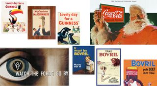
The 1930s wasn't the happiest time in history; it was the decade in which the fun of the Roaring Twenties morphed into the misery of the Great Depression and the rise of the Nazis. But every action produces a counter-reaction, and this was also a decade that saw a surge of innovation and resilience. And that made the 1930s a golden age of advertising; a period when creativity bloomed in the face of adversity, and brands dared to be different
For this article, we asked the experts to select their favourite 1930s ads. And this was not just an exercise in nostalgia, because these designs have a lot to teach modern designers. Like the best 1930s logos , these ads are mini works of art, infused with the spirit of the times. They capture the anxieties and aspirations of a nation grappling with economic hardship and yearning for a brighter future.
If this article inspires you, then make sure to read our guides to the best logos too. Our repository of the best logos by decade is a great place to start.
01. Guinness
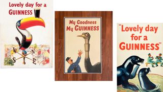
Marketing has always been key to the success of Guinness, and that's been the case now for almost a century. In the 1930s the brand commissioned artist John Gilroy to create a series of expressive ads and they were a monumental success, carving a special place in advertising history for their ingenuity, humour, and enduring cultural impact.
"Gilroy's 'My goodness, my Guinness' is a great example of taking a brave creative leap into the abstract with various circus animals depicted in humorous situations," says Matt Hauke, senior designer at Design by Structure . "On paper it makes little sense, but captures a joy and humour that only creativity could bring. Such was its success the Toucan remained an icon for Guinness throughout the 20th century, and the campaign paved the path for the brand's quirky and off-beat advertising for years to come."
A personal favourite of Gary Jacobs, creative partner at Live & Breathe , is Gilroy's 'Lovely Day for a Guinness'. "This timeless masterpiece revolutionised advertising art by infusing whimsical and captivating visuals into everyday activities, centred around the enjoyment of a pint of Guinness," he explains.
"Gilroy's artistic brilliance, coupled with the campaign's ability to evoke joy and camaraderie, transcends its era, making it an enduring icon and an inspiration for aspiring advertisers. The magic lies in transforming a simple product into a narrative that creates an emotional bond with consumers, showcasing the everlasting allure of creativity in the advertising industry."
Get the Creative Bloq Newsletter
Daily design news, reviews, how-tos and more, as picked by the editors.
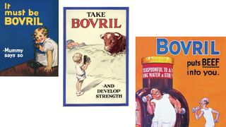
Bovril is a meat extract paste that's played a pivotal role in British history. It was a favourite of football crowds, a popular choice amongst soldiers during the First World War, and the only hot drink that Ernest Shackleton's team had when they were marooned on Elephant Island. Advertising was key to maintaining the brand's market dominance, and The History of Bovril Advertising by Peter Hadley is required reading for anyone in the advertising profession today.
"Bovril's art style was so very 1930s," says Benny Bentham, creative director at Waste Creative . "A sense of art deco wholesomeness, with bold colours and usually a picture of a cow or a heroic man flexing his muscles after drinking it. These posters are iconic, of an era, yet also timeless. 'It must be Bovril', 'It puts beef into you' and 'Develop strength' are three lines of copy I've remembered since childhood, after seeing my gran's Bovril poster showing a boy taking a photo of a cow that looks very displeased it's about to be turned into a drink. I always found it mildly disturbing, but I remembered it!"
Karim Salama, director at e-innovate , is equally enthused about this pioneering brand. "Bovril’s 1930s campaign is often regarded as a product of the zeitgeist of the time," he explains. "Symbolising health, prosperity and strength in a period of substantial economic uncertainty was a fantastic way to market a brand. The inclusion of the iconic bull was one of the first popular instances of anthropomorphism, and its influence is reified to this day.
"It would be hard to say that any of the most popular marketing campaigns involving animals would still be here were it not for Bovril’s Bull," he adds. "The perspicacity of GEICO’s Gecko; Aflac’s Duck; even Frosties' Tony the Tiger may not have been nearly as effective were it not for Bovril’s inclusion of an animal in the marketing. The fact Bovril managed to use this symbolism effectively taught every brand since that anthropomorphism is a very effective marketing tool."
03. Coca-Cola
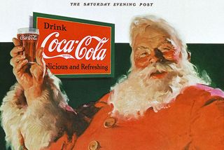
There's a persistent urban myth that Coca-Cola invented Santa Claus, which is certainly not true. But the company's advertising did play a big role in shaping the jolly character we know today.
Before the 1930s, there were many different depictions of Santa Claus around the world, including a tall gaunt man, an elf and even a scary version. But then in 1931, Coca‑Cola commissioned illustrator Haddon Sundblom to create paintings which established Santa as a warm, happy character with human features, including rosy cheeks, a white beard, twinkling eyes and laughter lines. The ad first appeared in The Saturday Evening Post and Collier's in December 1931.
"You can't get more iconic than Coca Cola's Santa, surely?" says Hauke . " Their 1931 campaign was initially launched to remind people that Coca Cola isn't just for hot, summer weather but all year round too. It proved to be a stroke of genius giving the drink an unrivalled, and globally understood, brand ambassador – at zero cost – and permanently tied the drink to one of the most loved holidays in Christmas. Such was its impact it has maintained relevance for generations to come."
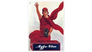
When the German multinational conglomerate Agfa introduced Agfacolor Neu, a multi-layer colour reversal film in 1936, it was a true game-changer. Considered the first commercially successful colour film, its vibrant colours and ease of use revolutionised photography. And of course, it needed a suitably eye-opening advert to draw attention to this incredible innovation. "The beauty of this ad is its graphic simplicity," says Natasha Blevins, creative director at We Are Collider . "Ditching traditional headlines and calls-to-action, it instead opts for product focus and expressive imagery. Its strength lies in the dynamic diagonal layout, where hands and a flowing scarf pull the eye.
"The restrained colour palette supports this with striking visual contrast. But there’s also a clever narrative: the protagonist is getting the attention of the people she’s photographing, as well as us – the audience. In an era dominated by housewife-centric ads, this offers a refreshing and progressive portrayal of female modernity."
05. Dubonnet
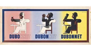
Created by wine merchant and chemist Sir Joseph Dubonnet in 1846, Dubonnet is an aromatised wine originally conceived as a way to get French Foreign Legionnaires in North Africa to drink quinine. This beautiful 1930s ad for the brand was created by painter, commercial poster artist and typeface designer AM Cassandre, whose innovative and avant-garde approach to design earned him a prominent place in the Art Deco movement.
Adele Leyris, design director at House 337 , outlines just what's so clever about it. "It's a three-step sequence showing the different moments of pleasure while interacting with the drink," she explains. "You start by admiring it (Du bo = Du beau), then you enjoy drinking it (Du bon), and then you serve yourself another glass of Dubonnet wine. Cassandre masterfully uses negative space to show the impact of the product on the character as he fills up in colour.
"This is the perfect example of considered design efficiently serving an emotional message about the brand, which was never seen before in 1932," she adds. "You still see some of the old painted ads in rural villages and cities across France."
Rob Kavanagh, executive creative director at Oliver UK , is also a fan. "Ever since I saw this poster at university, it’s held a place in my mental scrapbook of great and guiding work," he enthuses. "The ad is elegant and clever, but it’s also instructive. Back in the 1930s, creatives weren’t armed with insights. Here, Cassandre presumably took a long, hard look at the product, and the inherent creative solution patiently revealed itself."
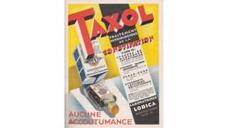
When compiling lists of the best historical adverts, it's tempting to focus solely on the fun stuff like the brands we've covered above. But while the subject matter of pharmaceutical advertising may be uncomfortable at best and disgusting at worst, from a designer's point of view it's still fertile ground for inspiration, argues Ed Lloyd, creative strategist at Seed .
"Pharmaceutical advertising involves the challenge of communicating precise – and perhaps dry – information in an interesting way," he points out. "Many adverts in France in the 1930s met this challenge through incorporating bold and experimental graphic styles that drew upon popular art movements of the time, such as Bauhaus, Constructivism, Art Deco and Art Nouveau."
This example for the constipation medication Taxol (not to be confused with the cancer treatment of the same name) features striking type, clashing colours and diagonal lines often associated with constructivism. "Interestingly, TFL’s latest safety campaign , designed by illustrator Andrew Hudson, seems to be pulling from a similar artistic territory to also communicate well-being quickly and boldly," adds Lloyd.
07. Cadillac
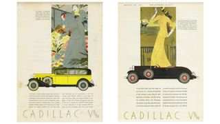
We may associate Cadillac with the 1950s and 1960s, but it was founded long before that, in 1902. And Raj Davsi, creative director at FutureDeluxe , is in love with these 1930 ads for the American car brand.
"One admirable aspect of their advertisements in each car release is the consistent design language throughout the collection," he notes. "The illustration of the car is beautifully simple, and I particularly enjoy the graphic nature of the side profile. It feels very iconic, and the car's central position attracts the viewer's eye to it. I love this and adopt this central framing a lot in my work today."
He continues: "The image illustration combined with the car has been executed in a clean and tasteful manner, with a great use of the Art Deco style. It provides a glimpse into the possible lifestyle of the car owner. The ad's clean layout and thin typography create a luxurious feel, which is very fitting for the car."
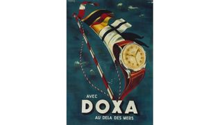
Another favourite of Davsi's is this ad for Doxa, an independent Swiss watch manufacturer founded in 1889 and today best known for its dive watches. "There are many reasons I love what they have done with this ad," he says. "The chosen colours give off a luxurious and expensive vibe, reflecting the intended target market. I love the balance of blues, browns and reds. The beautiful use of composition is so pleasing.
"The angle used to compose the watch feels heroic and strong," Davsi continues. "We have had the privilege to design and develop watch commercials at FutureDeluxe, looking for similar compositions when making a watch film. The compositions of the watch extend seamlessly into the sail, which is such a nice touch and feels like luxurious promotion. I am into the bold type and composition. It feels robust, almost representative of the watch."
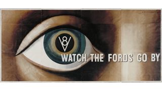
As the O.G. of mass production, we tend to think of Ford cars as basic, solid, simple and dependable. But there's nothing simple or boring about this 1937 ad for the brand, another classic designed by A.M. Cassandre.
"The artist strips away practically every convention in advertising in this ad," says design commentator Daniel Shannon , "harnessing European minimalism to elevate the medium to something more akin to modern art. At the same time, he pre-empted the more emotive approach seen in decades to come.
"A striking, singular all-seeing eye remains curiously anonymous in an age where most advertising was heavily gendered," Shannon continues. "Our faceless protagonist rises above the role of consumer and is instead an observer – liberated and seemingly unwanting. The headline, so unassuming as to verge on the existential, pulls away from the iris – the first place the viewer’s eye naturally falls. The delicate alignment of the cap ‘W’ with the V8 icon lends a compositional elegance rarely seen at a time where typography was often an afterthought."
10. London Underground
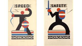
The London Underground map and logo are two of the most celebrated pieces of design in modern history. But there's plenty more to discover in the transport network's past, and here are two great examples of its long-standing tradition of effective and impactful advertising.
As Marc Allenby , co-founder and chief creative officer at Hijinks Collective, notes: "The London Underground design, iconography and poster design has become a key part of London’s rich history and a visual representation of the city itself. An artist named Alan Rogers created these beautiful pieces of advertising for the London Underground. Less ad, more art, Alan elegantly – and in my mind so smartly – incorporated the iconic roundel into his bold, modernist designs."
These posters may have been published in the 1930s but they remain timeless pieces of communication. "These ads elegantly and stylishly convey their message through beautifully crafted illustration and typography," says Allenby. "They communicated a new world, a world of optimism and futuristic romanticism of travel. They helped to turn OOH posters into something that you’d put on your wall. My takeaway; let's bring art back into today's OOH!"
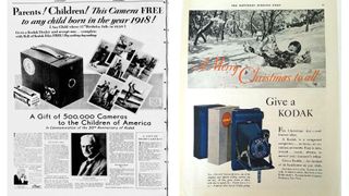
Kodak played a crucial role in making photography accessible to the general public from the late 19th century onwards. A company that was all about visual communication could be expected to deliver great advertising, and they didn't disappoint.
"Kodak has a rich advertising history in the early 1900s," says Angela Sturrus, creative director at Hook . "With memorable slogans such as 'You press the button, we do the rest' and 'Take a Kodak with you', the Kodak brand became an established household name that made photography accessible and approachable. By the 1930s, Kodak started to broaden its target market by approaching the younger generation and, subsequently, their parents."
Sturrus recalls how they started this advertising strategy with a splash on their 50th anniversary by giving 500,000 cameras away to any 12-year-old child. In the coming years, they coined their holiday slogan of 'Give a Kodak' where they reinforced the idea of gifting a Kodak to children.
"This creative approach helped embed Kodak into the hearts and minds of the Greatest Generation, which continued to pay off for the brand for decades," adds Sturrus. "Overall, Kodak’s creative strategy during that time was not only captivating, catchy, and insightful but also completely futuristic."
For more design inspiration, see our favourite print ads .
Thank you for reading 5 articles this month* Join now for unlimited access
Enjoy your first month for just £1 / $1 / €1
*Read 5 free articles per month without a subscription
Join now for unlimited access
Try first month for just £1 / $1 / €1
Tom May is an award-winning journalist and editor specialising in design, photography and technology. Author of the Amazon #1 bestseller Great TED Talks: Creativity , published by Pavilion Books, Tom was previously editor of Professional Photography magazine, associate editor at Creative Bloq, and deputy editor at net magazine. Today, he is a regular contributor to Creative Bloq and its sister sites Digital Camera World , T3.com and Tech Radar . He also writes for Creative Boom and works on content marketing projects.
Related articles
- 2 Users are already poking fun at the Discord rebrand
- 3 Apparent Nothing Phone 3 design leak has fans intrigued
- 4 Belgium's Tintin-inspired Euro 2024 kit is just adorable
- 5 I love the dual design of the new Quiet Place film posters
- 2 "Keep being curious": Inside the art of Marcel Mosqi
- 3 Google's AI 3D avatars are giving uncanny valley vibes
- 5 The 'Netflix of AI' wants to upturn Hollywood but its shows are truly terrible
0, text: error()">
0, text: error(), css: errorCssClass">
Reset your password
Enter your email address or username and we’ll send you a link to reset your password
Check your inbox
An email with a link to reset your password was sent to the email address associated with your account
Provide email
Please enter your email to complete registration
Activate to continue
Your account isn't active yet. We've emailed you an activation link. Please check your inbox and click the link to activate your account
0, text: error" style="display: none;">
0, text: success" style="display: none;">
- Relationships
The Bored Panda iOS app is live! Fight boredom with iPhones and iPads here .
- Partnership
- Success stories
- --> -->